|
|
![]() |
||||||||||||||||||||
|
Best Blu-ray Movie Deals
|
Best Blu-ray Movie Deals, See All the Deals » |
Top deals |
New deals
![]() ![]() ![]() ![]() ![]() ![]() ![]() ![]() ![]() ![]() ![]() ![]() |
![]() $82.99 4 hrs ago
| ![]() $74.99 | ![]() $101.99 19 hrs ago
| ![]() $99.99 | ![]() $124.99 1 day ago
| ![]() $39.02 3 hrs ago
| ![]() $29.95 | ![]() $24.96 | ![]() $35.99 | ![]() $70.00 | ![]() $22.96 | ![]() $19.12 |
![]() |
#6405 |
Blu-ray Ninja
|
![]()
Finally finished my first pass of "The Big Bang Theory" season 1... I have a few more things I need to change (like moving Leonard to the left about an inch on the back)(And redoing the credits as those are just placeholder I borrowed) but for the most part I think i'm done.
![]() |
![]() |
![]() |
#6406 | |
Blu-ray Knight
|
![]() Quote:
|
|
![]() |
![]() |
#6408 |
Blu-ray Ninja
|
![]()
No... I wish I was that talented. I've been looking for the artists name to include it in the finished credits on the back... But I can't find it. A friend of mine sent me the picture... I liked it so much I wanted to use it for a cover...
|
![]() |
![]() |
#6409 |
Expert Member
|
![]()
Was bored today so I thought I'd play around and see if I could create an authentic looking studio version of Finding Nemo before it comes out. Wanted to fool my friends to look like I just picked it up at the store. Will update the features when they become available.
![]() |
![]() |
![]() |
#6410 |
Junior Member
|
![]()
Had this quick idea for the cover and decided to make it a Criterion cover because of the style. I did it up in 3 colors cause I can not decide what one I like best, let me know what yall think.
The standard blue: ![]() A simple black: ![]() and a slightly custom red: ![]() Last edited by karbacca; 05-10-2011 at 04:50 AM. |
![]() |
![]() |
#6412 |
Junior Member
|
![]()
Actually, me and pretty much everyone else on here design there covers to print size and have had many of them printed and put in cases.
|
![]() |
![]() |
#6413 |
Special Member
|
![]()
Inspired by the individual ALIEN releases, I made some variants for those who want to put their Anthology sets in a 6-BD case (22 mm spine).
[Show spoiler] [Show spoiler] [Show spoiler] [Show spoiler] PM if you want different spine/front combinations & I'll try to accommodate. My previous Anthology customs are in this gallery. |
![]() |
![]() |
#6415 | |
Active Member
|
![]() Quote:
|
|
![]() |
![]() |
#6416 |
Special Member
|
![]() |
![]() |
![]() |
#6417 | |
Special Member
|
![]() Quote:
![]() Sample > Printed [Show spoiler]
|
|
![]() |
![]() |
#6418 | |
Banned
|
![]() Quote:
|
|
![]() |
![]() |
#6419 | |||
Blu-ray Guru
|
![]() Quote:
![]() Quote:
Quote:
|
|||
![]() |
![]() |
#6420 | |
Blu-ray Samurai
|
![]() Quote:
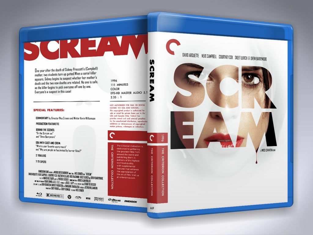
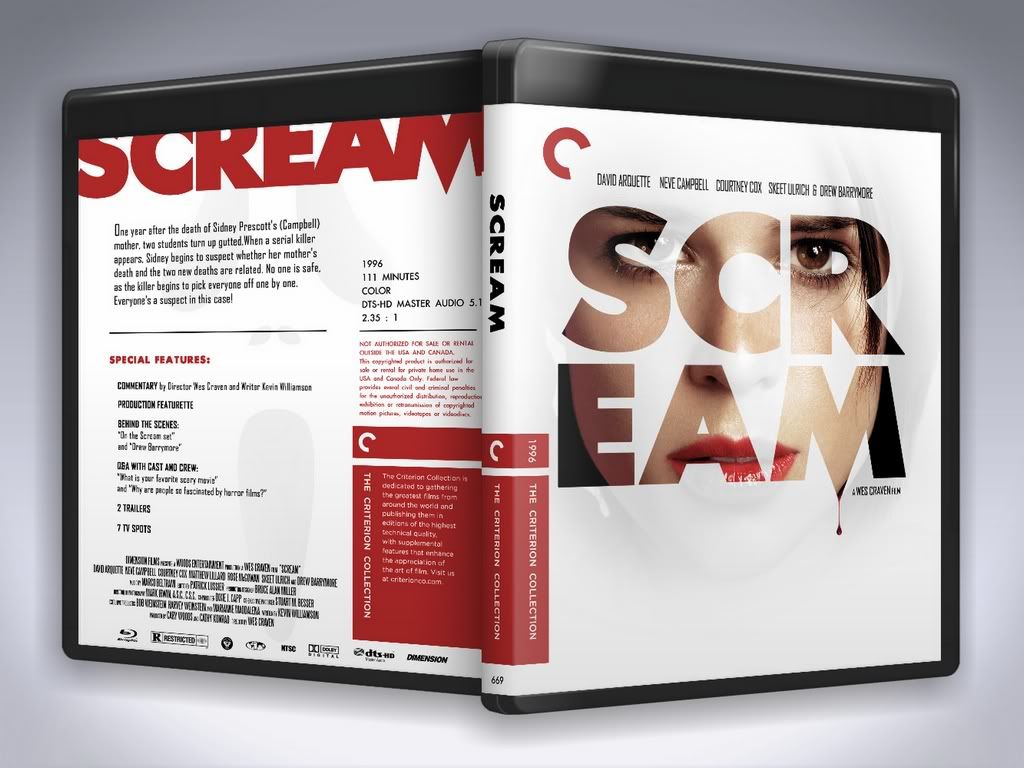
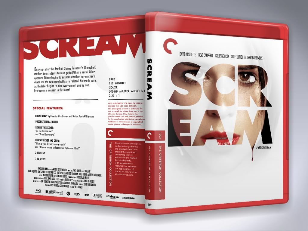
Example: Is there another way to display the title treatment on the front with Neve Campbell coming through without splitting the one word (short word) title into two lines? How about displaying the title vertically (up and down) in a larger font, thus keeping the title intact and maintaining the same design element? If you try that, keep in mind to keep the blood droplet vertical (with the center of "gravity"). And the back. I don't know if you're trying to duplicate a Criterion cover or add design elements of your own or attempting both, but the title treatment being chopped off at the top doesn't really bode well in MO. It doesn't look like the right font or the right spacing between the letters to do achieve that look, in other words it doesn't look like it's necessary. The tops of the "S" and the "C" still extend down into the field. You have plenty of room on the back with what little info and specs are being used. And lastly, the summary and specs on the back look like they're just aligned to the left side of the text box and placed randomly throughout. Try boxing the font and extending the font to both edges (Center to align to both edges) to create a square for the summary instead of aligning everything to the left. I know it all might sound nit picky and sorry if it does. If you like it the way it is then good, go with it. Like I said, the cover displays quality program (PS) skill but the execution could be better. (geez, I sound like those Battle Royal competition judges! ![]() Last edited by aggienader08; 05-10-2011 at 09:14 PM. |
|
![]() |
|
|
![]() |
![]() |
![]() |
||||
thread | Forum | Thread Starter | Replies | Last Post |
Custom cover art for Blu-ray printing thread | General Chat | bpmford | 81 | 04-29-2024 11:54 PM |
Official Custom SteelBook™ Cover Art Thread | Blu-ray SteelBooks | jamesaevans | 265 | 05-05-2019 02:29 AM |
Official Custom Cover Art Thread(Archived Posts) | Blu-ray Movies - North America | Trean | 2598 | 05-21-2009 07:22 AM |
Custom Cover Art - Questions About... | Blu-ray Movies - North America | Trean | 0 | 05-15-2009 05:19 AM |
Tags |
art, cover, cover art, coverart, insert, print, printer |
|
|