As an Amazon associate we earn from qualifying purchases. Thanks for your support!                               
×

Best Blu-ray Movie Deals


Best Blu-ray Movie Deals, See All the Deals »
Top deals | New deals  
 All countries United States United Kingdom Canada Germany France Spain Italy Australia Netherlands Japan Mexico
A Better Tomorrow Trilogy 4K (Blu-ray)
$82.99
1 day ago
Superman I-IV 5-Film Collection 4K (Blu-ray)
$74.99
 
Weapons (Blu-ray)
$22.95
11 hrs ago
Mission: Impossible - The Final Reckoning 4K (Blu-ray)
$27.99
6 hrs ago
The Good, the Bad, the Weird 4K (Blu-ray)
$41.99
3 hrs ago
Samurai Fury 4K (Blu-ray)
$19.96
5 hrs ago
Avengers: Endgame (Blu-ray)
$7.00
1 hr ago
Elio (Blu-ray)
$24.89
5 hrs ago
Burden of Dreams 4K (Blu-ray)
$34.99
8 hrs ago
Shudder: A Decade of Fearless Horror (Blu-ray)
$101.99
1 day ago
Jurassic World: 7-Movie Collection 4K (Blu-ray)
$99.99
 
Superman 4K (Blu-ray)
$29.95
 
What's your next favorite movie?
Join our movie community to find out


Image from: Life of Pi (2012)

Go Back   Blu-ray Forum > Movies > Blu-ray Movies - North America
Register FAQ Community Calendar Today's Posts Search


Reply
 
Thread Tools Display Modes
Old 09-10-2011, 07:39 AM   #7681
cragman69 cragman69 is offline
Member
 
cragman69's Avatar
 
Dec 2010
Portsmouth, UK
3
66
Default Ghost rider double play cover

Quote:
Originally Posted by cragman69 View Post
[Show spoiler]


Hi all recently purchased The Last Samurai second hand, unfortunately case and cover were damaged, and i had a dvd copy already so i decided i would make a double play sleeve, head over to my deviant art space to download full size image if interestedhttp://cragman69.deviantart.com/#

the artwork on back is from another custom but im not sure who found the image but no details, i have made changes to this though to clean the image up and make it more clear.
Quote:
Originally Posted by Nissen View Post
Not bad, not bad at all! I like your front and the gold spine. That's one of the better posters I've seen for this movie. Did you add that black splotch (Radial Gradient?) on the bottom half to it to cover up some text?

I read why you included that Double Play banner, and I get it, but it's butt-ugly

Just a quick thing on the back, the text isn't centered properly, and there's the question of legibility. It probably looks fine full-size, no? Maybe line up the specs-box with the edges of the text?
Hi thanks for the comments in answer to your question yes i did add the black splotch to cover up some words on the poster i used, you are probably right about the butt ugly double play but for the purpose of why im using this i feel its needed for my own collection, i may upload a version without at somepoint, the back is not that editable as its from a scanned version of a region 1 cover, i have only changed colours and logos at bottom so text is not as easy to move about but i understand what you meen and if i have the time i may sit and do afresh backcover from scratch


well here is my next upload, similar too previous post i have purchased ghost rider second hand and already have the film on dvd and so have come up with double play cover hardest part of this cover was the flame frames on the back cover as trying to colour match ghost rider titles was painfull, let me know what you all think, love the critism
  Reply With Quote
Old 09-10-2011, 07:45 AM   #7682
cragman69 cragman69 is offline
Member
 
cragman69's Avatar
 
Dec 2010
Portsmouth, UK
3
66
Default Bluray cases

Hi all just thought i would mention also i found this website http://www.vernonlibrarysupplies.com...isc-cases.html i was after a 6 disk bluray box for a custom i want to do, the only downside is this is in the US, anybody no of a place that sells these in the uk?
  Reply With Quote
Old 09-10-2011, 08:09 AM   #7683
OrlandoEastwood OrlandoEastwood is offline
Blu-ray Champion
 
OrlandoEastwood's Avatar
 
Jun 2008
R-Point
86
24
Default

Have you tried Ebay UK?
  Reply With Quote
Old 09-10-2011, 08:13 AM   #7684
Nissen Nissen is offline
Special Member
 
Nissen's Avatar
 
May 2010
3
Default

Quote:
Originally Posted by DrrnHarr View Post
I posted my "For Your Eyes Only" cover to EuphoricFX if anyone is interested.
Could you post it here as well? I'd love to see how it turned out.
Or are you just slummin' with us forum-only fogies?
  Reply With Quote
Old 09-10-2011, 12:49 PM   #7685
DrrnHarr DrrnHarr is offline
Power Member
 
DrrnHarr's Avatar
 
Dec 2008
Wisconsin
41
818
352
2122
6033
6960
282
13
3
Default

Quote:
Originally Posted by cragman69 View Post
Hi all just thought i would mention also i found this website http://www.vernonlibrarysupplies.com...isc-cases.html i was after a 6 disk bluray box for a custom i want to do, the only downside is this is in the US, anybody no of a place that sells these in the uk?
No, but I would seriously hunt out Viva Elite cases rather than Vortex cases - Viva Elite is just a much better (and thinner) case.


Quote:
Originally Posted by Nissen View Post
Could you post it here as well? I'd love to see how it turned out.
Or are you just slummin' with us forum-only fogies?
I'll e-mail it to you Nissen...I'm not sure how to upload the full jpeg to this site.

I also completed "A View to a Kill" last night and part-way through getting "The Living Daylights" done.
  Reply With Quote
Old 09-10-2011, 02:33 PM   #7686
dvdmike dvdmike is offline
Banned
 
Jun 2010
1069
Default

Quote:
Originally Posted by Trekkie313 View Post
What the hell?

I spent many hours finding perfect pictures and fixing Cowboy's render problems, and now someone beat me to it?

Anyways, here is my WIP plus the original.


Here is my World Is Not Enough concept.


Who gave you permission to alter or re-use my work?
  Reply With Quote
Old 09-10-2011, 02:43 PM   #7687
lkmg lkmg is offline
Blu-ray Guru
 
lkmg's Avatar
 
Oct 2010
172
6
Default

Quote:
Originally Posted by cragman69 View Post
Hi thanks for the comments in answer to your question yes i did add the black splotch to cover up some words on the poster i used, you are probably right about the butt ugly double play but for the purpose of why im using this i feel its needed for my own collection, i may upload a version without at somepoint, the back is not that editable as its from a scanned version of a region 1 cover, i have only changed colours and logos at bottom so text is not as easy to move about but i understand what you meen and if i have the time i may sit and do afresh backcover from scratch

[Show spoiler]


well here is my next upload, similar too previous post i have purchased ghost rider second hand and already have the film on dvd and so have come up with double play cover hardest part of this cover was the flame frames on the back cover as trying to colour match ghost rider titles was painfull, let me know what you all think, love the critism
Nice cover. But you forgot to place the 2 important logos at the front cover. After all, it is a UK cover art.
  Reply With Quote
Old 09-10-2011, 07:23 PM   #7688
Rusty100 Rusty100 is offline
Power Member
 
Rusty100's Avatar
 
Dec 2008
1
Default

Yeah, I've seen some edited versions of my covers on foreign sites. You're not doing it for money (I hope) so who cares?
  Reply With Quote
Old 09-10-2011, 07:41 PM   #7689
cjclifford cjclifford is offline
Member
 
cjclifford's Avatar
 
Oct 2010
2
456
246
2
USA

Quote:
Originally Posted by dvdmike View Post
Who gave you permission to alter or re-use my work?
Imitation is the sincerest from of flattery.
  Reply With Quote
Old 09-10-2011, 07:49 PM   #7690
TriuneImpurityRites TriuneImpurityRites is offline
Senior Member
 
TriuneImpurityRites's Avatar
 
Jul 2011
An hour west of Philly
980
30
Default

hahahah
  Reply With Quote
Old 09-10-2011, 07:54 PM   #7691
Nissen Nissen is offline
Special Member
 
Nissen's Avatar
 
May 2010
3
Default


This is my 2nd attempt at Rocketeer. A third one, based on the usual cover art (the one with the blue background) is coming up soon.

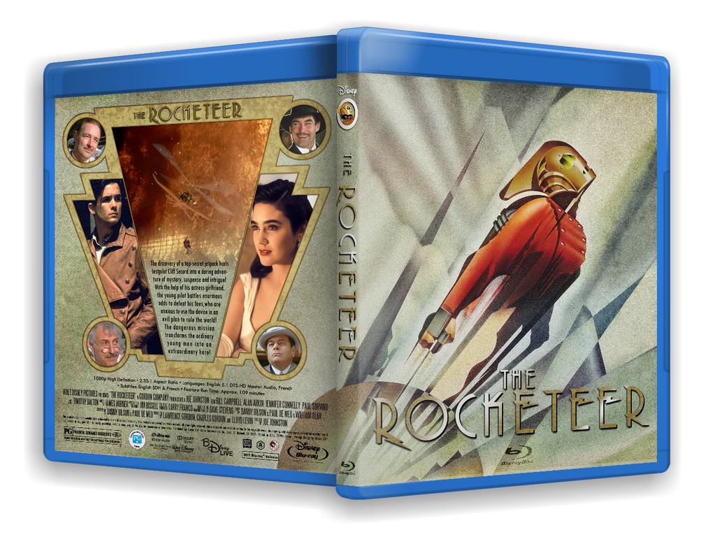
For this one I went the commercial route, using the teaser poster everyone wants. I don't think that particular image has ever worked on the posters I've seen, and when I recently saw the soundtrack cover it dawned on me why.
The CD, with it's square front, showed more of the "dead space" surrounding the figure. It occured to me that all the posters and covers I've seen over the years have been cropped too tightly. The figure is too angular and complex a graphic to be comfortably readable when it fills a canvas. It needs more space around it to not look too busy.

The challenge was to find a high-rez image of the poster, with all the surrounding background intact. Of course, no such image exists, so once again I had to cobble together a poster from several images. Luckily, The Rocketeer has seen a moderate resurrection the last six months, and more High-Rez scans of the posters have surfaced. I wound up extending much of the background with heavy use of the clone tool, the smudge tool (!) and various gradients using the CD inlay as a guide to how it should look. I always like to extend the front image into the spine and back, so I had to make quite a bit of image realestate up from scratch. I think the result turned out fine.

Once again, I elected not to use any art from the comics or of any prop replicas or fanmade costumes. I'm quite stubborn about that. The one exception is the insignia on the spine, by Deviant Artist J.K. Antwon. It will be on the spine of all my Rocketeer covers, I think.

To give it that old, authentic art-deco look I employed some quite heavy grain (noise) on the background, and superimposed old, weathered paper on the whole cover. Just to dirty it up a bit, like I always like to do. (I made a hold-out matte for the main figure and the rear images to occlude the paper there, so that they would stand out more.)

For the logo I reverted to the original, theatrical title treatment. It is a little spindly and hard to make readable on a busy background, so I was forced to revert to drop shadows to really make it stand out. I gave the letters a metallic texture, as it seemed quite appropriate. To everyone's relief, I included the "The" this time

The back warranted another art-deco theme. I found some lineart of an art-deco pattern via Google, and recreated parts of it using the pen tool and stroking with a 5 pixel brown line. I overlaid a pressed aluminium texture which isn't really historically appropriate, but it brought the whole element to life. Lastly I applied a 2-pixel black glow to frame it against the background.

The art-deco pattern gave me some natural shapes for the images and text that tied the whole thing together. The circles with faces was an afterthought, when I decided I wanted to feature more of the players from the movie. All those faces are screengrabs from a 720p HDTV capture I have laying around. They're not properly posed photographs, but they'll do. (I would like to have access to screengrabs for every project I do, that way I'm not reliant upon just what a still-photographer happened to capture way back when.) You'll excuse the use of a major spoiler image (also a direct frame grab), but I thought it was the perfect image to make the film seem action-filled and exciting.

Re: the strict layout of the back, I'm generally a disciple of the golden rule of composition, but with an art-deco layout the complete centering of everything is quite legitimate. Symmetry can't really be avoided when evoking this style.

If ever a cover called out for a black Blu-Ray case this is it. My heart just sank when I created a preview with that blue monstrosity. One could see it as a design challenge, to make the coverart work with the blue border, but I can guarantee you no designer was involved when "they" decided to go blue for all cases. May "they" rot in hell.

Sorry.

Anyway, much to my delight, Disney released the official specs only yesterday, so I could include accurate info on the release. The rumours indicate it will be a barebones release, so I made no accomodation for special features in my layout. If that changes, I'll have to rethink the back a bit. (For once I find myself wishing for a barebones release )

That's it. Another cover under my belt. Hope everyone loves The Rocketeer as much as I do. True fans may PM me for a High Rez copy of this.
  Reply With Quote
Old 09-10-2011, 08:41 PM   #7692
GunRanger GunRanger is offline
Expert Member
 
GunRanger's Avatar
 
Jun 2010
44
48
Default

That's great, though I would remove the blu ray logo from the front.
  Reply With Quote
Old 09-10-2011, 09:44 PM   #7693
Tyger Tyger is offline
Power Member
 
Tyger's Avatar
 
Aug 2009
Sacramento, CA
-
-
-
-
1
Default

Quote:
Originally Posted by Nissen View Post
I don't think that particular image has ever worked on the posters I've seen, and when I recently saw the soundtrack cover it dawned on me why.
The CD, with it's square front, showed more of the "dead space" surrounding the figure. It occured to me that all the posters and covers I've seen over the years have been cropped too tightly. The figure is too angular and complex a graphic to be comfortably readable when it fills a canvas. It needs more space around it to not look too busy.
Nissen, I LOVE that Rocketeer cover completely as is. But curious, if you think the poster image works best with more dead space and you had to recreate most of it anyway, did you think about tilting it at all to add more dead space?
  Reply With Quote
Old 09-10-2011, 09:49 PM   #7694
cpowell21 cpowell21 is offline
Active Member
 
Aug 2011
204
Default Orphan blu ray cover Anyone

Orphan blu ray cover in need! Custom or original would be accepted, I just need something.. Can anyone help?
  Reply With Quote
Old 09-10-2011, 10:11 PM   #7695
Nissen Nissen is offline
Special Member
 
Nissen's Avatar
 
May 2010
3
Default

Quote:
Originally Posted by Tyger View Post
Nissen, I LOVE that Rocketeer cover completely as is. But curious, if you think the poster image works best with more dead space and you had to recreate most of it anyway, did you think about tilting it at all to add more dead space?
Tilting it? In what way?

It is the diagonal direction of the figure that gives it that dynamic movement. Tilt it in any direction and it starts to become stagnant. Whoever made this image knew what they were doing. Does anyone know the artist? I don't think it was Dave Stevens himself.
  Reply With Quote
Old 09-10-2011, 10:20 PM   #7696
Tyger Tyger is offline
Power Member
 
Tyger's Avatar
 
Aug 2009
Sacramento, CA
-
-
-
-
1
Default

Just a bit to the right, just a little more East than North. Like I said, just curious if you thought about it to give it some more dead space. I personally love it the way it is.
  Reply With Quote
Old 09-10-2011, 11:12 PM   #7697
GunRanger GunRanger is offline
Expert Member
 
GunRanger's Avatar
 
Jun 2010
44
48
Default

Can anyone make a Thor cover for me using these two pics?


[Show spoiler]
Front


Back
  Reply With Quote
Old 09-10-2011, 11:45 PM   #7698
DrrnHarr DrrnHarr is offline
Power Member
 
DrrnHarr's Avatar
 
Dec 2008
Wisconsin
41
818
352
2122
6033
6960
282
13
3
Default

Quote:
Originally Posted by Nissen View Post

This is my 2nd attempt at Rocketeer. A third one, based on the usual cover art (the one with the blue background) is coming up soon
Excellent work Nissen, I love the 1930s feel you have going on the cover.

Below are two WIPs for "A View to a Kill" and "The Living Daylights" based on the 007 template I put together (with much input from Imrahil, Nissen and others). I have always liked the poster art for these two movies. Once again they are WIPs not the finished product (e.g. TLD still has some FYEO info on it and Roger Moore on the spine etc).


  Reply With Quote
Old 09-10-2011, 11:58 PM   #7699
lkmg lkmg is offline
Blu-ray Guru
 
lkmg's Avatar
 
Oct 2010
172
6
Default

Quote:
Originally Posted by DrrnHarr View Post
Excellent work Nissen, I love the 1930s feel you have going on the cover.

Below are two WIPs for "A View to a Kill" and "The Living Daylights" based on the 007 template I put together (with much input from Imrahil, Nissen and others). I have always liked the poster art for these two movies. Once again they are WIPs not the finished product (e.g. TLD still has some FYEO info on it and Roger Moore on the spine etc).

[Show spoiler]

A View to a Kill's front cover looks a bit plain, probably too much white patches. The Living Daylights looks great. As usual, I like your back cover.
  Reply With Quote
Old 09-11-2011, 04:30 AM   #7700
gregmasciola gregmasciola is offline
Special Member
 
May 2008
55
539
454
11
Default

Quote:
Originally Posted by DrrnHarr View Post
Excellent work Nissen, I love the 1930s feel you have going on the cover.

Below are two WIPs for "A View to a Kill" and "The Living Daylights" based on the 007 template I put together (with much input from Imrahil, Nissen and others). I have always liked the poster art for these two movies. Once again they are WIPs not the finished product (e.g. TLD still has some FYEO info on it and Roger Moore on the spine etc).

[Show spoiler]

Those look pretty good to me. The only thing I would change is the pattern on the back kind of blends in with the titles and the specs. I would apply a black gradient at the bottom to separate them a bit.
  Reply With Quote
Reply
Go Back   Blu-ray Forum > Movies > Blu-ray Movies - North America

Similar Threads
thread Forum Thread Starter Replies Last Post
Custom cover art for Blu-ray printing thread General Chat bpmford 81 04-29-2024 11:54 PM
Official Custom SteelBook™ Cover Art Thread Blu-ray SteelBooks jamesaevans 265 05-05-2019 02:29 AM
Official Custom Cover Art Thread(Archived Posts) Blu-ray Movies - North America Trean 2598 05-21-2009 07:22 AM
Custom Cover Art - Questions About... Blu-ray Movies - North America Trean 0 05-15-2009 05:19 AM

Tags
art, cover, cover art, coverart, insert, print, printer


Posting Rules
You may not post new threads
You may not post replies
You may not post attachments
You may not edit your posts

BB code is On
Smilies are On
[IMG] code is On
HTML code is Off

Forum Jump


All times are GMT. The time now is 08:11 PM.