|
|
![]() |
||||||||||||||||||||
|
Best Blu-ray Movie Deals
|
Best Blu-ray Movie Deals, See All the Deals » |
Top deals |
New deals
![]() ![]() ![]() ![]() ![]() ![]() ![]() ![]() ![]() ![]() ![]() ![]() |
![]() $82.99 8 hrs ago
| ![]() $35.94 1 hr ago
| ![]() $74.99 | ![]() $23.60 1 hr ago
| ![]() $101.99 23 hrs ago
| ![]() $34.68 1 hr ago
| ![]() $28.10 2 hrs ago
| ![]() $48.44 2 hrs ago
| ![]() $33.54 4 hrs ago
| ![]() $99.99 | ![]() $39.02 7 hrs ago
| ![]() $29.95 |
![]() |
#8321 |
Expert Member
|
![]()
Sent a message to WB that I like everything about TFOTR except the green tint. The sharpness and contrast are excellent but having characters going between different looks (in daylight) to identical green eyes and teeth (in dark scenes) looks ridiculous. It's like a glow in the dark fellowship. Cyan in the skies makes it look like some weird planet from the ending of 2001: A Space Odyssey.
|
![]() |
![]() |
#8322 |
Member
Apr 2010
|
![]()
So they meant to make the white title "The Fellowship Of The Ring" a light shade of green? The title, not the film itself. The title was always white before and the titles of TTT & ROTK are still white... and the FOTR title is green. Not basing off screencaps posted here, I did the same test myself and measured the color values.. the credit is green. Since when do they color grade film after digital titles are superimposed?
That's just the tip of the iceberg. Not enough evidence to suggest an authoring mistake you say? As opposed to what? Some PR mouthpiece at Warner saying "all is as intended" and dead silence from Peter Jackson on the matter? |
![]() |
![]() |
#8323 |
Active Member
Jun 2011
|
![]()
Hey Everyone,
Let me start by saying that I now own the retail discs ... so I'm glad we can get that out of the way ![]() I've spent the last few days doing more testing and tweaking on my settings. The tweaks haven't been major, but I was trying to get as close as possible to a result that did nothing except remove the green tint and resolve the contrast changes to the extent possible. For any who didn't get a chance to check out my initial methodology, it can be found here: https://forum.blu-ray.com/blu-ray-mo...ml#post4904422 Now, I have some interesting stuff to share that some people will definitely find interesting and that will resolve some confusion over what exactly the green tint is doing. A number of people have commented that the green tint actually makes the picture better, at least in some areas. I think what I'm going to show you over the next few posts might change your mind, insomuch as I will present what I believe is an extremely close approximation of what the new INTENTIONAL color grading is apart from the green tint. This will allow people to see how the green tint is affecting scenes even when the effect is not obvious. First, I want to address one or two comments about the sample of Aragorn seen in the post I linked above. It was commented that my "fixed" version was merely trading one highly processed image for another, while someone else said that I had merely produced a white-balanced image. Neither of these comments is entirely accurate. The whole point of what I'm doing is trying to isolate and neutralize the green tint as one step, and correct the super-boosted contrast just to the point of neutralizing the change as another step. What I'm doing is not about trying to do my own color grade or arrive at a "better" image. Again, I'm merely trying to neutralize the two issues that that are the biggest cause of complaint and see what the EE version would like without those particular changes. I find this to be an interesting pursuit and I think some other people will share my sentiment. Before going into samples, I want to address my methodology adjustments. If you read the post I linked above, you will see that after getting the image to a reasonable approximation of what it would be without the tint, I was able to get right back to the EE image with two clicks by adding Photo Filter > Green over top at default settings. Now this next bit should have occurred to me right away, but it was late and it didn't. What I realized was that if Photo Filter > Green really achieves the EE result at default settings, which it does, then instead of trying to identify the "effective tint" for neutralizing, there could be a quicker way. If, in fact, the green tint in the movie is the result of applying Photo Filter > Green at default settings over the whole film, then applying the exact opposite of that at default settings should neutralize the tint even more effectively and lose less of the color information in the process. So that's what I tried ... and it worked like a charm. For anyone who wants to repeat my tests, the color of the green Photo Filter is as follows: LAB: 71, -65, 65 RGB: 25, 201, 25 The exact opposite is: LAB: 71, 65, -65 RGB: 240, 123, 255 After applying the reverse of the Green filter, it then required even more subtle (less extreme) image adjustments to correct the resulting problems. Now, what do I mean by "to correct resulting problems"? When the green tint is removed, some natural green in the image, the green that closely resembles the effective tint, is removed along with it. Correcting this merely means making slight adjustments to color balance to return some of the natural green to the image. I have aired on the side of caution, making smaller adjustments rather than larger ones, risking the return of too little green rather than too much. Nonetheless, I'm quite confident with the results of this set of filters. The images I'm going to post are NOT a matter of simply exchanging the highly processed image of FOTR EE for different highly processed images and these are NOT simply white-balanced. I believe these are an extremely reasonable approximation of what the images would look like in each case with the green tint removed and the super-boosted contrast dialed back to normal levels. One final word about the contrast. People who have been talking about "black crush" as a problem have been doing so for a reason. The green-tint issue can be almost perfectly resolved with very little damage to the image - so little as to be functionally inconsequential in the vast majority of cases. The same cannot be said of the contrast issue. In any already dark scene, vast amounts of information are actually lost by the contrast boost and it is impossible to get back by any method that I'm aware of. For all intents and purposes, what used to be image information is now solid black, so in scenes like that, my samples will give you a good idea of what kind of color and detail can be salvaged and what cannot. 
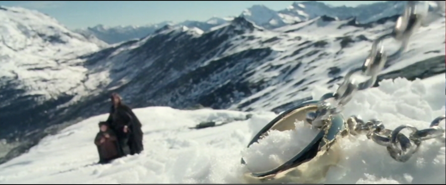
Ok, I think that's enough intro information for now. Let me finish this post with a repeat of the sample of Aragorn on the mountain, but now using my updated filters. You'll notice that some of the detail in the background mountain has been rescued and the snow has the slightly bluish tint found in previous releases and in the other two films. No specific changes were made to achieve this. Everything you see in all "fixed" versions are the result of simply dropping my new filter set onto an EE screencap to "fix" it. Tell me your thoughts on this if it interests you: ![]() More screenshots will be coming in the next post(s) showcasing a few different things. |
![]() |
![]() |
#8324 |
Banned
|
![]()
I really am stunned by the people who actually think they can get an exchange program going to replace a transfer the director of these movies gave the OK for. I mean do they seriously think warner will go against PJ wishes and just drop the transfer he supervised for FOTR and the whole set
![]() ![]() |
![]() |
![]() |
#8326 | |
Banned
|
![]() Quote:
|
|
![]() |
![]() |
#8327 |
Blu-ray Knight
|
![]()
How is the PQ for the 2nd and 3rd movie for the Theatrical versus the The Extented?
PQ and SQ the same, just extended? or is the actual quality better on these two as well? Theatricals are pretty damn cheap at amazon and I'm tempted..Entire trilogy for $24 shipped.. Last edited by Monkey; 07-03-2011 at 05:34 AM. |
![]() |
![]() |
#8328 |
Blu-ray Knight
|
![]()
I just watched Two Towers for the first time in years. Over the past couple of weeks I saw many people asking the question:
"FotR got a color change. Why not Two Towers? It looked all natural" Ok, I don't know what Two Towers everyone else was watching, but there were PLENTY and I do mean plenty of scenes that had an interesting color timing in them that did not give off a natural look. The scenes that take place in Gondor with Faramir are the most obvious examples. So I have to really wonder where all this talk of the other films looking natural came from because from what I saw that was not the case. I think PJ was going for a different look for each film using a different timing to set a certain mood and it worked brilliantly in FotR and it worked just as well in Two Towers. Ill see if that holds up for Return of the King. So there are plenty of scenes in The Two Towers in which the color timing comes across as unnatural. |
![]() |
![]() |
#8329 | |
Blu-ray Guru
|
![]() Quote:
The remaster was redone 100% by Warner altering every digitally graded scene that Peter Doyle and Andrew Lesnie had done with heavy use of teal and orange no where to be found in any of the original films, deep blacks causing underexposure that was never there in the trilogy until now and green filters used through an entire film unlike prior where it was only used for certain scenes. Numerous post in this very thread and others all over the net have mentioned the exact same problem, so I am not the only one seeing it. Though you would have to be blind not too since the new digital grading was done by people never involved with the making of the film in the first place. |
|
![]() |
![]() |
#8330 | |
Blu-ray Samurai
|
![]() Quote:
The difference in the title pages was jarringly different. That is puzzling. I'm in the "I believe the changes were verified to be accurate" camp, but the difference in the title pages is bizarre. There is no need to compare screen caps or make A/B comparisons. I didn't even bother to put FOTR Disk 1 in again to verify the difference. It wasn't necessary. I sincerely believe that my reaction would have been the same even if I had never read a single post or review mentioning tint. In the interest of continuity they should have at least given the title pages the same look. What's up with that? ![]() Last edited by raygendreau; 07-03-2011 at 01:32 PM. |
|
![]() |
![]() |
#8331 | |
Blu-ray Ninja
Oct 2008
|
![]() Quote:
|
|
![]() |
![]() |
#8332 | |
Blu-ray Guru
|
![]() Quote:
As for the titles being OMG GREEN, chalk it up to laziness instead of it being a LOL AUTHORING MISTAKE. IT IZ DEFECTIVEZ! You guys are reaching. Grow up and move on and just not buy the set and pretend that you're sticking it to the studio who murdered one of your favorite films. |
|
![]() |
![]() |
#8334 |
Active Member
|
![]()
sorry Duffy, been working the last couple days so i havn't had a chance to respond but i have a Sony S570....i checked for updates as well and it is updated....thanks for the input
|
![]() |
![]() |
#8336 |
Blu-ray Champion
|
![]()
Wow, you dorks are still talking about green tints and colour timing. Maybe some of you guys should get your sets calibrated or something. I watched mine tonight and it's just beautiful ! None of that green crap you guys are talking about. The set is perfection.
|
![]() |
![]() |
#8337 |
Blu-ray Guru
|
![]()
So Peter Doyle and Andrew Lesnie redid the digital grading for the new FOTR transfer? I would assume then they would complete the 30% not finished yet not. Instead I guess they decided to redo the entire film in teal and orange and deepen the black levels. You know like 95% of every Warner bluray sporting a new transfer within the last few years.
|
![]() |
![]() |
#8338 | |
Blu-ray Guru
|
![]() Quote:
|
|
![]() |
![]() |
#8339 |
Blu-ray Samurai
|
![]()
Here are some images taken from the iTunes Digital Copy of the Lord of the Rings Extended Edition of FOTR-- apparently this Digital Copy does not "suffer" from the added "green". When you watch the Blus for the FOTR, see if it looks like those below:
The One Ring, in the White and Slightly Blueish Snow: ![]() Bilbo's Sign - Aged Paper (Not White, and Not Greenish): Notice the Detail, and rich color ![]() ![]() Ring Wraith Revealed in Blue-Grey Ghostly (not green) Glory - or Horror! ![]() Gandalf in Rivendell - Rich Color, Not Greenish ![]() Gandalf in the Snow! ![]() Apparently, the Windows Media version of the FOTR EE DOES suffer from the green tints. We are not told if the iTunes Digital Copy came from the same master created for the Blus, but it would be logical to think that the Digital Copies all were created from the same master as the Blus. Of course, there was no such thing as a Digital Copy when the DVDs of the EEs came out, but it is possible that the iTunes Digtial Copies were created from the DVD masters. But if that were the case, then the Windows Media files would have likely also been created from the same master as the iTunes one. So why "greenish" on the Windows version, and the Blu, and NOT on the iTunes version?!?! It boggles the mind, but DOES point to a mistake being made SOMEWHERE in the authoring of all of these media. So I think we are all more than justified in requesting a proper explanantion, and not just a quick press release from WB PR. Finally, here is that shot of Aragorn from the FOTR EE Digital Copy, and the one HeKS is using to show what the "green" tint is doing: Aragorn in the Snow! - iTunes Digital Copy ![]() What the "green" tint looks like on the Blu of FOTR ![]() ![]() Last edited by DarkDune; 07-03-2011 at 06:12 AM. |
![]() |
![]() |
#8340 | |
Blu-ray Ninja
Oct 2008
|
![]() Quote:
The relevant quote: "Before we started timing the third film, at Peter Jackson’s request we went back to film one, scanned in the 30% that had not been scanned previously and output the first film as a digital intermediate. So now all three films have been completely digitally timed." (which really makes the theatrical release questionable, if they were sitting on a full DI the whole time...) |
|
![]() |
|
|
![]() |
![]() |
|
|