|
|
![]() |
||||||||||||||||||||
|
Best Blu-ray Movie Deals
|
Best Blu-ray Movie Deals, See All the Deals » |
Top deals |
New deals
![]() ![]() ![]() ![]() ![]() ![]() ![]() ![]() ![]() ![]() ![]() ![]() |
![]() $82.99 5 hrs ago
| ![]() $74.99 | ![]() $101.99 20 hrs ago
| ![]() $124.99 1 day ago
| ![]() $99.99 | ![]() $39.02 4 hrs ago
| ![]() $29.95 | ![]() $24.96 | ![]() $70.00 | ![]() $35.99 | ![]() $19.12 | ![]() $23.79 16 hrs ago
|
![]() |
#7022 |
Power Member
|
![]()
Awww, Nissen, I was hoping for one of your in-depth posts for that Punisher cover, I love those, but I know there's like no material for it. It's a success just by omitting the back still of the deleted scene of the female detective undercover, that always bugged me on the VHS and bugged me even more on the DVD since there aren't any deleted scenes so you still don't see it!
|
![]() |
![]() |
#7023 | |
Special Member
|
![]() Quote:
As you say, there's almost zero picture material available online for movies from the 90's. For this I scanned the front of my laserdisc again. (Momma always said holding onto everything was gonna come in handy.) As you all know, almost every cover for The Punisher uses the same photo of him standing in front of his bike, and mine's no different. The problem is that most of the posters obscure most of the bike with a ginormous logo for The Punisher. This was the case with my laserdisc too. However, I found a halfway decent picture of a french poster with the logo over his head instead (Google images is your friend), so I used parts of that image to patch up the missing parts of the bike and P's legs. You can kinda/sort of tell that the resolution isn't there on the replaced parts, but at least I got the entire bike in the picture. I cloned the background to extend it so I could move P. further back. It made all the difference. The image just needed a little breathing room. When you don't get the cool bike and the broad-legged stance in the picture, it just throws the whole image off. I ended up replacing the background anyway, using a stock photo of rusty streaks (Google images again). The grimy look just fits this movie, I think. I experimented with a photo of some sewers for the background, but found it too literal. I upped the contrast of the front image to give it a more modern look, and eliminating the original background took away the bluish/purple look the posters all have. I wanted to make this cover almost b&w. But the back... I always have trouble with the backs. A good back separates the proper coverdesigners from the wannabees, I think. No fake modesty here, I'm just not there with the backs yet. What I have got down is carrying over the look of the front into the back. Usually this entails extending the background of the front image into the spine and back. Usually it's easier to just replace the background than it is cloning parts of the poster as an extension. I wanted to use the target/bullseye theme from the opening credits of the actual movie. I always try to use imagery or themes from the movie as a starting point for the back. (The axes and swords in Conan, the broken mirror from The Shadow, the art deco pattern from The Rocketeer etc.) I still had to resort to the "images in boxes", because there was just not enough real estate within the separate, concentric circles to properly display more than one image. I opted to use it as a watermark only and have plain stills from the movie in boxes beneath. Whenever I can I try to represent as many of the characters from the film on the back. I also look for some scenery wide-shots to sort of "open up" the look of the film for the back (You can see it on my Ben-Hur cover). No such image was available for this, and I didn't want to use a stock image of a sewer either. Whenever I make a "I wish" cover for a movie that doesn't have an actual release, I try to leave room for future fact boxes with supplements and specs. That's why the top half of the back is a little airy. You'll note that none of my covers have barcodes or any of that "official" clutter on the backs. I DO use the templates from different studios as a starting off point, but usually wind up removing about 99% of the clutter. I'm finding this is also making my backs look less professional, I'm sad to say, so I make exceptions from time to time. For Nonexistant BDs (TM)* the legal blurb and BD-live logos seem kinda bogus anyway. *I'm trademarking that "Nonexistant BD" moniker. It will be the theme for most of my covers, I'm afraid. The spines. God, I love the spines. They are so quick to do, and I get a kick out of finding little graphics to put in there. What could be better than The P's skull? (Found a photo by someone who painted the skull on black and framed it. I credited the artist on the back, I always feel that's appropriate. If I knew who took the stock photo for the rusty metal I'd credit that person as well.) The more I look at this one, the more I see that the font (name escapes me at the moment) doesn't work for the spine. It's just not legible at that size, I'll have to replace it or enhance the hairlines or serifs or something. So there you have it. This took me a couple of days to put together, on and off. As some of you may be aware, there was an incident over here in Norway this friday, which put a damper on my enthusiasm for something so trivial as custom covers in the grand scheme of things. Anyway, life goes on for the most of us, and I really do enjoy making these covers. (and writing about them ![]() |
|
![]() |
![]() |
#7025 |
Blu-ray Guru
|
![]() |
![]() |
![]() |
#7027 |
Special Member
|
![]()
Reaper, it's just that this question gets asked every other page on this forum, and for myself I'm getting a little tired of it so I just ignore it. I do apologize... </sarcasm>
To answer your question, any glossy/semi-glossy paper will do, preferably a little heavy, but not so thick it causes creasing at the bends. I use a no-name brand myself, but feel free to experiment. Make sure you set your printer settings to match whatever paper you use. I find that once the insert is under the plastic, it is very forgiving. Even cheapo copy paper looks decent under plastic (though a little dull colourwise). Just use regular A4 sheets and trim the printouts along the edges of the artwork. Invest in one of those paper-cutters if you're going to be doing this more than once. What will REALLY make your covers look professional is if you round off the corners like many of the official cover inserts have. |
![]() |
![]() |
#7028 |
Power Member
|
![]()
I definitely enjoy seeing them and reading about them makes them even more interesting. Whether or not the design speaks for itself (I totally got the allusion to the opening credits), it's still cool to read the insights from the designer.
|
![]() |
![]() |
#7030 |
Active Member
|
![]() |
![]() |
![]() |
#7031 |
Banned
|
![]()
Yeah, back panels are often one of the most difficult parts of covers to design. Fronts and spines can also be complex, but they're usually simple by comparison.
|
![]() |
![]() |
#7032 | |
Special Member
|
![]() Quote:
![]() Here are links to the hi-res APES inside art: 22mm spine with crop marks; 22mm with no crop marks; 15mm with crop; 15mm without. None have the faint trim line seen above, that is just a preview. But they all have some extra bleed, since alignment with the outside cover may not be exact. Let me know if this works for you! Last edited by HanaBi; 07-25-2011 at 02:40 PM. |
|
![]() |
![]() |
#7033 |
Active Member
|
![]()
OK... Went a slightly different route. I will still make Struzan versions, but I'm really feeling these. Opinions, please. Ep1 and 2 are mostly done, the rest have Ep1 backs for now. I also made bonus disc cases for my 6 disc setup and for just the 3 discs that come in the BD set.
...and yes, these will be available for download when they are complete! ![]() ![]() ![]() ![]() ![]() ![]() ![]() ![]() |
![]() |
![]() |
#7034 | |
Senior Member
|
![]() Quote:
|
|
![]() |
![]() |
#7036 |
Banned
|
![]()
Nice work so far, Bartlett, but I have a few (minor) suggestions for you.
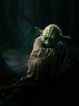
1) Ditch the barcode. It takes up too much space on the back, and most customs don't use them anymore to begin with. You could easily put 2 horizontal screenshots instead. 2) The back panel's summary is very uneven at its right edge. A more professional choice would be to square it off completely, like newspapers do with their articles. This can be done very easily, by altering the spacing on each line, and/or converting the whole thing to a "paragraph text" block. 3) Try and use character shots that match better with the themes from each film. For example, the masked Vader would work better for Episode IV, since that's where he was first revealed in '77. Also, I think Yoda would do better on "Empire", and I have a great shot you may want to consider for that. Here it is; hope you like it. ![]() ![]() |
![]() |
![]() |
#7037 | |
Member
|
![]() Quote:
|
|
![]() |
![]() |
#7038 |
Special Member
|
![]()
Bartlett. Those covers are excellent. Nice to see someone trying something new for Star Wars. Everyone and his uncle are gonna be doing Drew covers for this, so you might as well try something different, right? The vertical direction of the Star Wars logo seems somewhat arbitrary, though. I see why you did it, but it's the only element with that alignment on the whole cover. (Spines don't count :-) To me it disrupts the otherwise assured execution of a good, clear design.
I like your choice of blue for the basis of the covers. The spine numbers in the dark band REALLY works for me, but perhaps you should think up something for that area on the bonus discs as well. Appendix A and B or something, I don't know. This really comes into it's own when you line up the spines. The backs are nice and clean, but the more pictures the merrier, so maybe you should sacrifice the UPC for an image like suggested. Block-adjusting the text on the back may work, just watch out so the back doesn't get "boxy" as a whole. I like the listing for the contents, you include a lot of info in a clear and legible manner. Gentlemen, we have a professional designer in our midst. As for the choice of characters to put on the fronts, you will find no two persons in the entire world who would agree, so just go with your gut on these. I think your choices are brave, but if you really want to shake things up you'll use Jar-Jar on Ep. I. I for one, can really appreciate the work that goes into a project like this, and how much time you spend sweating the details. Thanks for sharing with us and baring yourself to constructive (hopefully) criticism. |
![]() |
![]() |
#7039 | |
Blu-ray Samurai
|
![]() Quote:
|
|
![]() |
![]() |
#7040 |
Active Member
|
![]()
Bartlettphoto, I gotta say, I was dead-set on the Struzan covers but now I'm thinking I may prefer these latest covers. They're really bold and stand out brilliantly. Also, I think your character choices for each movie work just the way they are. Great job!
|
![]() |
|
|
![]() |
![]() |
![]() |
||||
thread | Forum | Thread Starter | Replies | Last Post |
Custom cover art for Blu-ray printing thread | General Chat | bpmford | 81 | 04-29-2024 11:54 PM |
Official Custom SteelBook™ Cover Art Thread | Blu-ray SteelBooks | jamesaevans | 265 | 05-05-2019 02:29 AM |
Official Custom Cover Art Thread(Archived Posts) | Blu-ray Movies - North America | Trean | 2598 | 05-21-2009 07:22 AM |
Custom Cover Art - Questions About... | Blu-ray Movies - North America | Trean | 0 | 05-15-2009 05:19 AM |
Tags |
art, cover, cover art, coverart, insert, print, printer |
|
|