|
|
![]() |
||||||||||||||||||||
|
Best Blu-ray Movie Deals
|
Best Blu-ray Movie Deals, See All the Deals » |
Top deals |
New deals
![]() ![]() ![]() ![]() ![]() ![]() ![]() ![]() ![]() ![]() ![]() ![]() |
![]() $82.99 7 hrs ago
| ![]() $74.99 | ![]() $23.60 1 hr ago
| ![]() $101.99 23 hrs ago
| ![]() $35.94 31 min ago
| ![]() $34.68 52 min ago
| ![]() $28.10 2 hrs ago
| ![]() $48.44 1 hr ago
| ![]() $33.54 3 hrs ago
| ![]() $124.99 1 day ago
| ![]() $99.99 | ![]() $39.02 6 hrs ago
|
![]() |
#7701 | |
Special Member
|
![]() Quote:
The original poster art adds sentimental value to people like me who grew up with the movies. For a younger generation it may not have the same effect, though, and I see the reasoning behind updating packaging for older movies. Sometimes the original poster art is substandard, though. Not all poster artists were accomplished. That's why the custom cover culture emerged, I guess. Nice seeing the original poster for A View to a Kill, but I was always puzzled by the dual poster-within-a-poster art. (I lived in Qatar at the time, and I remember they covered up Tanya Roberts' bare arms and legs with pink to match her dress on the poster.) The image of Moore (who I've exchanged words with at a book signing, BTW) and Grace Jones was used for the promotional posters, I believe. Then the full poster with the Golden Gate appeared later (same artist?) The version you're using was everywhere, but I still think it's an example of an ad agency's inability to make up their mind. Elegant, it ain't, and I can guarantee you the artist was pulling his hair out. I like the gradient on the Living Daylights title. Maybe you can apply something like that to all the title treatments? I swear, this is the last time I nag you about the tt's. ![]() I received your last cover by mail. The white-on white text is perfectly legible in full-size. Have you printed a copy to see if it is OK on paper as well? I wasn't asking you to post the full size here, just to put up a nice preview of the finished product. I hope you'll be keeping us abreast of your progress in this forum as well. Once they're all done, you should repost them in one single post to have them together. I was wondering, what's that "Anvil on an Island"-looking image you have down by the logos. I am unfamiliar with it. I've been thinking, we're all doing these covers in Photoshop, but there's nothing wrong with doing them in InDesign. I seem to remember a custom cover designer doing his in Illustrator, even. Keep 'em comin' |
|
![]() |
![]() |
#7702 | |
Power Member
|
![]() Quote:
Thank you for the detailed post. I cannot take credit for the outer glow on the white lettering on the back. Imrahil suggested it after the layer mask and gradient options did not work. It was a stroke of genius on his part. I met Roger Moore at a book signing on Long Island in 2008 while he eas promoting his autobiography. He was gracious but his personal protection team were a little over zealous IMO (blocking a 7 or 8-year old boy from meeting Moore - really!) I'm not sure about the poster within a poster effect, but I think it works in the context of the cover art. I personally prefer the Bond and Stacey on the Golden Gate Bridge art to the Bond and May Day art (and I have the two posters as separate images), but I'm not sure how I could work it onto the cover (what would I clip out). I could break the template and have that art take up the whole front, but then it would not fit stylistically with what I have for the rest of the series. No idea what that anvil on an island logo is. It came with the MGM template from customaniacs that I used to get my dimensions correct and in the layers panel it is simply referred to unhelpfully as "logo image". I personally think that InDesign would be a better tool than Photoshop for putting together covers, its simply more versatile, but then I might run into problems if I ever wanted to collaborate with someone using Photoshop. Incidentally, it was pointed out that I used art for AVTAK and TLD gunbarrel back covers and a still on the back cover of FYEO...which do people prefer? Last edited by DrrnHarr; 09-11-2011 at 03:58 PM. |
|
![]() |
![]() |
#7703 |
Special Member
|
![]() ![]() The final cover in my Rocketeer Trilogy. 
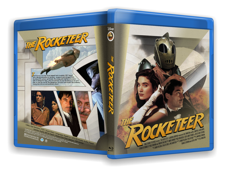
As you can see I used the US one-sheet art as a basis. I have stated before that I don't think it sells the film very well. On the other hand, it may sell the film, but it doesn't sell The Rocketeer. I think it is a major failing that the helmet isn't more prominent on the poster. They tried to rectify that by cramming in a poorly rendered Rocketeer figure (that I've plain dumped in my version). Anyway, I isolated the figures from the blue background using the Color Selection tool and deleting all blue pixels. The background wasn't uniform blue, so I had to apply some touch-ups by hand. I'm using a pen tablet which gives me great control for that kind of work. The blue was at odds with the yellow light on Bill Campell during the photo shoot, so the amber background fit much better. The jetpack had obviously been added later, as it was lit completely differently to the actor. When I changed the colour of the background I had to apply a Color Balance layer to the jetpack to blend it with it's new surroundings. As you can see I incorporated imagery from the in-movie propaganda film in the background. (And for an image on the back). Once again it pays to have a HD recording at hand for screen captures of whatever you want. On top of that I lifted some clouds from a wallpaper for the Sky Captain movie, the same one I used on my first Rocketeer cover. The old paper texture from my Mk.II cover is also there, but only at about 20% opacity. I just keep layering and layering and experimenting with the different blending modes until I'm happy. I was using a 600dpi scan of my Laserdisc cover, and it had some lettering covering the plane at the bottom. I replaced part of the tarmac and plane with parts from a poster I found online. I do touch-ups like that and removing the background at twice the size of the finished cover. That way it smooths out some of the rough edges when I shrink it down to cover size. Whenever I see the movie title on the top of a poster, I think it sort of closes the poster in and makes it claustrophobic. That's why I generally try to keep the title at the bottom or integrate it into the actual art somehow. I didn't want to obscure the hanger at the bottom, so my compromise was to cover up part of the all-important helmet instead. I was originally planning to use the art-deco title treatment for this, but the Indiana Jones style read better over the figures. This time I took the time to generate a "The" which wasn't part of the original title treatment originating from Europe. I cut and pasted elements from other letters to make the H, the only letter missing. The challenge on the back was finding images from the movie that didn't clash with the colour scheme of the cover. I couldn't find any, so I settled for a publicity still and a Rocketeer trading card. Since the front poster neglected the Rocketeer, I wanted him at least to be visible on the back, which limited my options severely. Almost all his apperances in the film are in broad daylight, or against a black night sky, neither of which fit on this cover. I added a 3 pixel brown stroke around the two loose images, and blended the borders in Overlay mode. The rest of the info on the back is just copied from my previous cover. A credit for J.K. Antwon for the spine image of the Rocketeer is once again included. I have ideas for at least two more Rocketeer covers, but I think I'll stop with this one. I'll be updating my Rocketeer Mk.I and then the Rocketeer and I are finished. PM requests for High Rez as usual. |
![]() |
![]() |
#7704 | |
Special Member
|
![]() Quote:
I also met Sir Roger while on a book signing tour here in Norway. Such a gentleman. Dressed to a T. I asked if I may shake his hand? "You certainly may", he replied. We shook hands and then he added "Now count your fingers" ![]() I'd been speaking with a 60-ish lady behind me in the queue. She was a big fan of Sir Moore from way back in his Ivanhoe days. She told him she and her sister used to have a crush on him when they were young. He replied without missing a beat; "But you're still young" (twinkle in his eye). What a great entertainer! |
|
![]() |
![]() |
#7706 | |
Special Member
|
![]() Quote:
Is it just coincidence that you started out with the Moore Bonds? Or are you like me, who grew up with them and secretly enjoy them the most, even though everyone tells you you shouldn't? ![]() |
|
![]() |
![]() |
#7707 | |
Power Member
|
![]() Quote:
![]() My favorite official 007 movie is "The Spy Who Loved Me." I say official because I have a soft spot for "Never Say Never Again" for a reason that can be summed up in two words - Barbara Carrera. Last edited by DrrnHarr; 09-11-2011 at 11:16 PM. |
|
![]() |
![]() |
#7708 |
Power Member
|
![]()
A lot better than my first attempt - right
![]() BTW Nissen, I forget to mention - you have done an incredible job on "The Rocketeer" covers. If you could shoot a high res version of that last version to my e-mail it would be much appreciated ![]() |
![]() |
![]() |
#7709 |
Member
Oct 2007
|
![]()
It WAS Dave Stevens who recently passed away I think.
MM |
![]() |
![]() |
#7710 |
Blu-ray Guru
|
![]()
I like this one quite a bit, but I think it needs a few minor tweaks:
I would include the synopsis in all or 2/3rds of the area with the animated german rocket soldiers (the center of the back), with a critic quote in the upper right corner. That would give the cover a bit more balance than having an open space in the center. I would also consider sliding THE ROCKETEER down a little on the spine to center it better. Also, does anyone know what happened to the trading/selling forum? I can't seem to find it anymore... Last edited by Monroville; 09-12-2011 at 03:11 AM. |
![]() |
![]() |
#7712 | |
Special Member
|
![]() Quote:
![]() It's interesting that you see that area as blank. I think the image holds it's own, but it's just an example of how design is not an exact science. People perceive things very differently. That's why it's always good to get a second opinion. The synopsis is too short to cover that area, the lettering would be too big and inelegant. I could maybe put an image of the Zeppelin explosion there instead. It would fit with the colour scheme. * I heard once, way back in my childhood, that the old, arabic, tapestry makers always included one error in their patterns on purpose as a sign of respect to Allah. You see, the notion is that only Allah is perfect. Of course, I never have to include errors on purpose, they just crop up by themselves, but I smile and just leave them there because I like thinking of them that way. Ha ha, using the word Allah in this post probably flagged it for every NatSec agency in the world. We're gonna be famous, lads! |
|
![]() |
![]() |
#7714 | |
Blu-ray Guru
|
![]() Quote:
Vortex cases have the little flap on the side that locks the case... Edit: Unless you were talking about the multi disc cases... in which you are right. Vivas are a bit thinner... and I'm too tired to try to find out if that's what you were referring too, sorry ![]() Last edited by threefiftyrocket; 09-12-2011 at 12:48 PM. |
|
![]() |
![]() |
#7716 | |
Blu-ray Guru
|
![]() Quote:
|
|
![]() |
![]() |
#7718 |
Power Member
|
![]()
Decided to work as my next Bond cover the rogue 1983 “Never Say Never Again.” I had a high resolution poster (2000 x 3000) and two low resolution posters (1200 x 800). The challenge I faced was that the high res poster was for a foreign market and the title treatment was burned into the image.
I tackled this by first using the clone stamp to cover up the foreign language TT and provide a color background consistent with the colors of the poster. I then borrowed items from another poster and added them to the poster, including a graphic of the nuclear weapon and extended the poster at the bottom for my Title Treatment. I had a TT with no background on hand but I could not have it white as it would too easily blend into the white background. I instead chose the aqua color to fit in with the water theme of the movie. How successful was I? I leave that up to you to decide: Never Say Never Again: ![]() In an effort to add a still to the back of the “Living Daylights” cover I ran into a snag in that the photo I was planning (Bond confronting Pushkin) did not fit into the scheme. Here is that cover. The Living Daylights: ![]() |
![]() |
![]() |
#7719 | |
Special Member
|
![]() Quote:
I run into this all the time, having incomplete posters in High Rez. Either they're cropped real tight or there's ginormous text covering them. If I can, I erase those parts and patch up the holes with a lower rez, clean poster when available. I just stack the big poster layer over the small poster, resizing the smallest one to match the big one. Then, when I erase the text portions on the big poster, the clean parts of the small poster show through. The trick is to match up the posters, get them identical in size, maybe rotate, colour-match them, ajdust brightness/contrast. Then I add some fake grain (noise) to the smaller poster to match the characteristics of the big poster. It mostly turns out okay. If any of you recall my Punisher cover, everything below Dolph's knees was fixed this way. If you look closely at the motorcycle's engine block, or the rear wheel, it loses resolution halfway down. Punisher cover: [Show spoiler] Just about every cover I do needs something like this, especially the ones for older movies where it's difficult finding resources. Beggars can't be choosers. |
|
![]() |
|
|
![]() |
![]() |
![]() |
||||
thread | Forum | Thread Starter | Replies | Last Post |
Custom cover art for Blu-ray printing thread | General Chat | bpmford | 81 | 04-29-2024 11:54 PM |
Official Custom SteelBook™ Cover Art Thread | Blu-ray SteelBooks | jamesaevans | 265 | 05-05-2019 02:29 AM |
Official Custom Cover Art Thread(Archived Posts) | Blu-ray Movies - North America | Trean | 2598 | 05-21-2009 07:22 AM |
Custom Cover Art - Questions About... | Blu-ray Movies - North America | Trean | 0 | 05-15-2009 05:19 AM |
Tags |
art, cover, cover art, coverart, insert, print, printer |
|
|