|
|
![]() |
||||||||||||||||||||
|
Best Blu-ray Movie Deals
|
Best Blu-ray Movie Deals, See All the Deals » |
Top deals |
New deals
![]() ![]() ![]() ![]() ![]() ![]() ![]() ![]() ![]() ![]() ![]() ![]() |
![]() $82.99 5 hrs ago
| ![]() $74.99 | ![]() $101.99 21 hrs ago
| ![]() $33.54 1 hr ago
| ![]() $99.99 | ![]() $124.99 1 day ago
| ![]() $39.02 4 hrs ago
| ![]() $29.95 | ![]() $35.99 | ![]() $70.00 | ![]() $24.96 | ![]() $28.10 20 min ago
|
![]() |
#9221 | |
Special Member
|
![]() Quote:
Gracious of you to credit the artist so prominently too. P.S. Why don't you add some red glow around the letters? (Sorry, inside joke). ![]() ![]() |
|
![]() |
![]() |
#9222 |
Expert Member
|
![]() |
![]() |
![]() |
#9223 | |
Banned
|
![]() Quote:
|
|
![]() |
![]() |
#9224 |
Member
|
![]()
Thanks! I really like how it turned out - really did consider a red light/outline on the logo once it was mentioned on here. Hehe. It felt right to add the cover artist's name, he did an amazing job with his sketch. Too, I think I might use this myself as well, for placing my bonus disk. Also, having a template by this guy named Chris Fletcher has helped a lot in creating my designs, to correct measurements.
But now, off to post my From Dusk Till Dawn cover in a few. Oh, here's what the Scream cover should look like once printed. ![]() ![]() |
![]() |
![]() |
#9225 |
Member
|
![]()
Having read the various reviews about releases from Echo Bridge, I still picked this title up:
![]() It wasn't as bad as I had thought it would be, but really could have been a better release for each of these movies or simply for the first one. Then again, I suppose we get what we pay for. Though, I'd be willing to pay more for a better transfer, once it does get a release here in the states. Either way, I found the cover art to be dreadful. So I made this cover instead. Still a work in progress, but the Alliance release cover, did inspire me. I have two versions of it, one with the texture and the... ![]() other without. ![]() What do you guys think? |
![]() |
![]() |
#9226 |
Blu-ray Guru
|
![]()
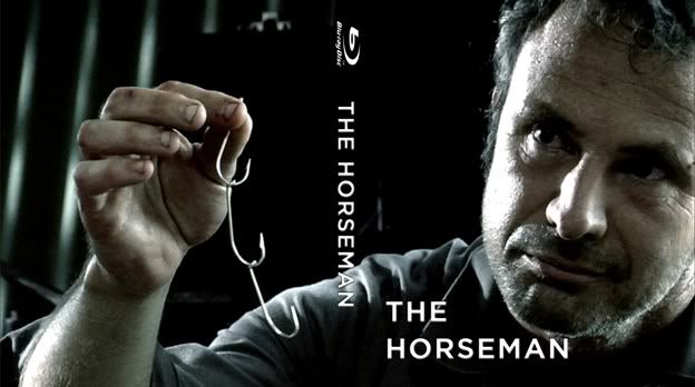
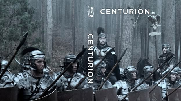
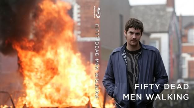
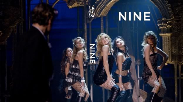
So I had bought a bunch of Blu-rays from Blockbuster that didn't have covers with them, and I couldn't find anything online for quite a few of them. Rather than take the time to make intricate covers, I went the easy way and had covers that spanned the front and back and just threw the title on it. Lo and behold, I actually like the look, so I thought I'd share some of what I have.
![]() ![]() ![]() ![]() ![]() Bear in mind these were just lazy attempts, but I really dig the clean look without any specs or credits on the back. I also made covers for: Tetro Pride and Glory The Runaways All Good Things The Disappearance of Alice Creed The Baader Meinhof Complex Nowhere Boy Precious The Boat That Rocked (Pirate Radio) Away We Go The Kids are All Right The Killer Inside Me If you're interested in having one, send me a pm. Last edited by broganreynik; 03-11-2012 at 01:59 AM. |
![]() |
![]() |
#9227 |
Member
|
![]()
Really enjoying your design for the film, 'The Horseman'. I've never seen it, but I would pick it up if I saw it with the cover design you made. The same with '50 Dead Men Walking', there's a clean simplicity to them, they work great! How much do Blus go for at Blockbuster?
|
![]() |
![]() |
#9228 | |
Blu-ray Guru
|
![]() Quote:
Last edited by broganreynik; 03-11-2012 at 03:03 AM. |
|
![]() |
![]() |
#9229 | |
Active Member
|
![]() Quote:
|
|
![]() |
![]() |
#9231 | |
Power Member
|
![]() Quote:
I'm gutted that haven't seen Still Screaming, its not available in the UK. Our Scream boxset (trilogy only) has standard extras, and Scream 4 has none. If any one fancies supplying me with a rip of Still Screaming that would be great ![]() |
|
![]() |
![]() |
#9232 | |
Member
|
![]() Quote:
|
|
![]() |
![]() |
#9235 | |
Special Member
|
![]() Quote:
The choice of background texture is perfect. Is that parchment or marble or? (There's a strange, blocky, hard edge thing going on with the texture next to the Raiders logo on the front. At least in the small previews). Front: I notice most people go for one of the Richard Amsel posters for Raiders. Drew did one for Raider's 10th anniversary, but for once I think he missed the mark. You'd think it was the obvious choice to use Drew's artwork for all films for the sake of consistency, but Amsel's posters for Raiders are iconic. The Raiders logo seems a hair too close to the top edge on the front. I have a thing about breathing room around elements, as you well know. Indy's rope being attached to the "R" is a nice touch. I would move the entire image up a bit, so that the space outside the frame at the bottom matches the space on the sides. In other words, a common margin width both vertically and horizontally. That leaves little room for the title at the top, though. Spine: Paramount logo too close to the edge :-) I see you put some thought and effort into making the title treatment fit. Good job. Messing about with the established logo comes at a price, though, and you lose some of the authenticity, for lack of a better word. Also, if you think ahead to the following movies, you haven't left room for the next titles being much longer. When the 4 covers are lined up next to each other, I think the titles should match in size (roughly at least). Colourwise, the Blu-logo grates in blue. Perhaps in "Lost Ark" yellow instead? I realize that the image with the gold border is a common theme across all your covers, and they must look impressive next to each other. BUT. Taking this Indy cover by itself, I'd make the frame identical to the one you have around the poster on the front. Back. I think there's just way too much text. Bigger (More?) images, less blurb. ![]() Good concept with the parchment area. It just seems a tad too yellow to me. Perhaps a lighter brown? Looks like you left some garbage along the outside when you created the parchment torn edges. At least I think that's what all the yellow flecks along the paper edge are. Intentional perhaps? Again, the blue for the grid seems to clash with the overall colour scheme. Plain black or white is always safe, or you could replicate the frame/border from the front again. The MGM/Fox grid seems out of place on a Paramount cover, but that's something only OCD cover-fanatics get hung up on. (Basically myself ![]() All in all, nitpicks. You've really come into your own since Flash Gordon! |
|
![]() |
![]() |
#9236 |
Power Member
|
![]()
As always, thank you for the great suggestions Nissen. As I tinker with my Indy template I will take the suggestions into account and make some corrections.
On the spine especially I will likely need to make some significant adjustments. I remember when I made my 007 template trying to figure out what the longest 007 title was to make the TT's of all the movies fit and somehow OHMSS slipped my mind, which meant a wholesale redo on all the covers when I reached that movie. I cannot take credit for Indy's rope attached to the "R" in "Raiders". If you check Amsel's original theatrical poster you will see that he has that element. It's something I have always thought was a nice touch ![]() The background texture is actually taken from Amsel's poster, cloned many times over. I made it slightly darker for the cover and lighter for the areas inside the frame but I think it nicely creates an "antique look", for lack of a better term. The frame was not initially on the front, but when I tried to work Drew's "Temple of Doom" onto the cover I just couldn't make it work, the black levels are so prevalent that removing them the whole cover fall apart. It quickly became apparent that I would need to use a frame on the cover. I have not done any futher work on TOD but that's the wholereason there is a frame on "Raiders". Imrahil made the excellent suggestion to make the box on the front more distinctive by making it lighter. Thanks again, I have a lot of work ahead of me but I know it will be worth it ![]() Last edited by DrrnHarr; 03-11-2012 at 10:57 PM. |
![]() |
![]() |
#9237 |
Member
|
![]()
I do find the cover you used, a lot better than the Italian cover. Really does capture the feel, of what I imagine the movie to be, than the Italian cover. Good job!
|
![]() |
![]() |
#9238 | |
Member
|
![]() Quote:
![]() |
|
![]() |
|
|
![]() |
![]() |
![]() |
||||
thread | Forum | Thread Starter | Replies | Last Post |
Custom cover art for Blu-ray printing thread | General Chat | bpmford | 81 | 04-29-2024 11:54 PM |
Official Custom SteelBook™ Cover Art Thread | Blu-ray SteelBooks | jamesaevans | 265 | 05-05-2019 02:29 AM |
Official Custom Cover Art Thread(Archived Posts) | Blu-ray Movies - North America | Trean | 2598 | 05-21-2009 07:22 AM |
Custom Cover Art - Questions About... | Blu-ray Movies - North America | Trean | 0 | 05-15-2009 05:19 AM |
Tags |
art, cover, cover art, coverart, insert, print, printer |
|
|