|
|
![]() |
||||||||||||||||||||
|
Best Blu-ray Movie Deals
|
Best Blu-ray Movie Deals, See All the Deals » |
Top deals |
New deals
![]() ![]() ![]() ![]() ![]() ![]() ![]() ![]() ![]() ![]() ![]() ![]() |
![]() $37.99 12 hrs ago
| ![]() $22.49 18 hrs ago
| ![]() $29.96 23 hrs ago
| ![]() $14.99 22 hrs ago
| ![]() $22.49 18 hrs ago
| ![]() $27.95 | ![]() $28.99 | ![]() $22.49 1 day ago
| ![]() $22.49 1 day ago
| ![]() $22.49 1 day ago
| ![]() $28.99 8 hrs ago
| ![]() $22.49 1 day ago
|
![]() |
#21 |
Blu-ray Guru
|
![]() |
![]() |
![]() |
#23 |
Blu-ray Ninja
|
![]()
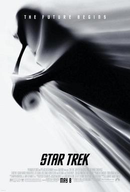
Well, I kind of figured that Paramount would revise the artwork...but not like this! I guess this is a bad time to say that now I actually prefer the original artwork. But whatever, I'm still gonna get Star Trek on November 17 regardless of the cover art.
|
![]() |
![]() |
#28 |
Active Member
Mar 2008
|
![]()
I don't get this. The art is understated, super-retro/pulpy, and stylish.
No floating heads, no bad collage. What's the problem? Can someone articulate why this is bad art? I LOVE understated art. For example... GOOD art: http://www.currentfilm.com/images3/t...ondvdcover.jpg BAD art: http://images.bidorbuy.co.za/user_im...105TheRock.jpg The first Trek art was good, but nowhere near as stylish and yet understated as the revised art. |
![]() |
![]() |
#31 | |
Blu-ray Ninja
|
![]() Quote:
Oh and I love that criterion cover to The Rock. I wish that was the BD cover. |
|
![]() |
![]() |
#35 | |
Member
Aug 2008
|
![]() Quote:
|
|
![]() |
![]() |
#36 |
Blu-ray Baron
|
![]() |
![]() |
![]() |
#37 |
Blu-ray Ninja
|
![]()
I get keeping it simple. But the first coverart was simply crap. It was just a shot of the Enterprise and someone going nuts with the photoshop blur tool.
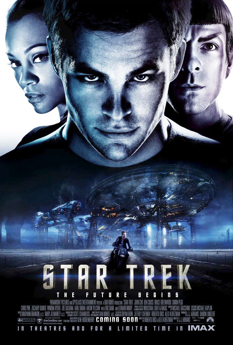
The second coverart is better, yes. I especially like the font chosen as it is evocative of the old series. However, I disapprove of the use of the Kirk teaser poster. Had they used the poster RiseDarthVader posted (or a variant thereof) as the basis for the second coverart, I feel the end result would be better. As I said before, the second coverart is an improvement but it still feels unfinished. Also, I'd drop the godawful "3-disc digital copy special edition" text. That can be left out and placed on a sticker that can be affixed over the shrinkwrap. Nonesense like that clutters the coverart and goes against the simplicity for which they're obviously aiming. |
![]() |
![]() |
#38 | |
Blu-ray Baron
|
![]() Quote:
Cover art or not, the movie is worth owning. ![]() |
|
![]() |
![]() |
#40 |
Blu-ray Ninja
|
![]()
Something about that onesheet Foggy posted rubs me the wrong way. It isn't just the floating heads. I think it's the shot of Kirk on the bike. I know he rides it in the movie but I get a Cool As Ice vibe from it on the the onesheet.
![]() Oh, heck yeah. They could change the coverart to a picture of a brown paper bag and I'd still buy it day 1. ![]() Last edited by RocShemp; 09-04-2009 at 08:07 AM. |
![]() |
|
|
![]() |
![]() |
![]() |
||||
thread | Forum | Thread Starter | Replies | Last Post |
Star Trek 2009 surpasses all previous Star Trek in adjusted gross $ | Movies | Havenbull | 15 | 09-20-2011 07:06 AM |
Star Trek TOS Box Cover Art symbols | Blu-ray Movies - North America | BluLobsta | 16 | 12-14-2009 09:25 PM |
Star Trek german cover | Blu-ray Movies - North America | Stu123 | 7 | 09-13-2009 11:56 PM |
Cover/Packaging for Star Trek: Original Motion Picture Collection | Blu-ray Movies - North America | aggienader08 | 29 | 05-05-2009 05:17 PM |
AWSOME Killzone 2 cover art! (Not official cover) | PS3 | TheFutureIsBlu | 9 | 08-16-2008 12:58 AM |
|
|