Quote:
Originally Posted by DGates01

As for the Machete cover, again, I appreciate your feedback. But I think you're getting lost in the minutiae. It's a solid design job. And I'm not trying to make it identical to the retail version, because, it's not going to the retail market, or the counterfeit market (which I'm feel that maybe some of these covers might be ending up in).
|
But see, to me, it's the minutiae that can destroy a good design. Look, if someone is anal-retentive enough to:
a) be bothered by the cover the studio designed
b) design their own complete cover - front to back
c) find good paper stock (or photo paper) that will aid in great looking covers
and
d) size and cut covers to the appropriate size
then, don't you think the minutiae is important? I mean, you're so picky that you go to the trouble to design, print and trim your own covers, but not so picky that you care that the stuff that you're printing is accurate or well thought out?
Quote:
Originally Posted by DGates01
I take no offense to that. But maybe we're confusing customizing with replicating. My first concern is a cover that is pleasing to the eye, with everything seeming to go where it should.
|
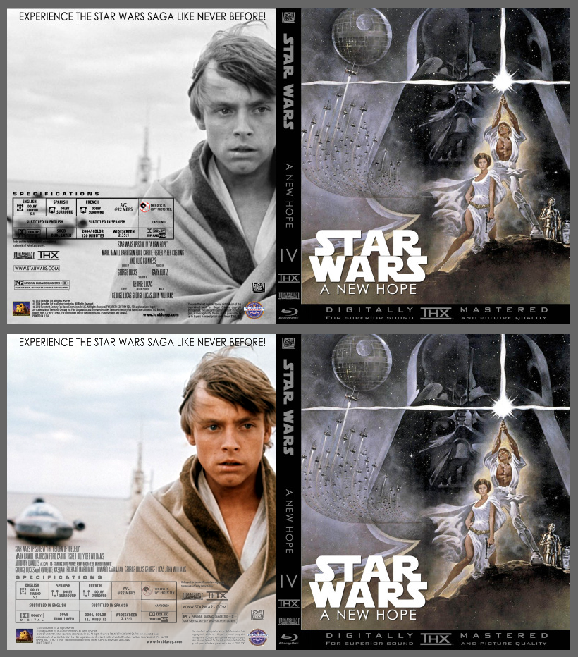
And that's my point. An NTSC logo shouldn't really appear on a Blu-ray cover. It's filler. It's minutiae that's aware that it's minutiae. It exists ONLY to be minutiae. Having the wrong running time or misusing a TrueHD logo serves no purpose on the cover, so why is it there? To ME, that's a sign it's NOT a solid design job, because the design, while being visually intriguing, still has to serve a purpose. Otherwise, what's the point of putting any information on it? I'll give you an example... If you look at dvdmike's Star Wars cover, he DOES have a TrueHD logo in the specs grid. Now, just having called you out for having a TrueHD logo on Machete and telling you that Fox uses DTS-HD Master exclusively, this would seem at odds with that complaint, wouldn't it? But I can guarantee you (without ever even speaking to him and based solely on the quality of the covers I've seen here) that that is a deliberate choice because dvdmike is taking into account Lucasfilm's relationship with Dolby that this might be the rare case where Fox uses TrueHD instead. That's a guy who's really thought this through. He's not just moving stuff around from a previous cover. Everything about what he's done is well thought out. He may benefit from other opinions on occasion, but I don't think he's that off the mark.
Quote:
Originally Posted by DGates01
The smaller details are of secondary importance. I've seen it the other way around. A person can nail the the technical details, but have no real design skills. Those covers, to me, look the worst.
|
But can't you have both? A pleasing/creative design AND getting all of the details just so? Getting the tech specs and the branding of the disc right is far more of a design challenge than someone photoshopping "picture, picture, box of text, picture, picture, picture, box of text, picture, picture, box with credits, giant logos." Trust me, it's much more difficult to mirror what would appear like a genuine studio release while developing unique creative concepts to blend together with. I find dvdmike's covers to be very close to that goal. Like I said, he's most certainly in the area of 'refining' with these. Another example, on his
Phantom Menace cover... I would probably slide the back image just a hair more to the right to clear Anakin of the Specs Grid. It's a minor slide; probably 20 pixels. But it's not a poor design by any definition of the word. The design (even as minimalist as it is right now without the special features) looks finished. You could print that up today and have it ready on the shelf. That tells
me its a good cover.
")
")
")
")
")
")
")
")
")
")
")
")


 Linear Mode

