As an Amazon associate we earn from qualifying purchases. Thanks for your support!                               
×

Best Blu-ray Movie Deals


Best Blu-ray Movie Deals, See All the Deals »
Top deals | New deals  
 All countries United States United Kingdom Canada Germany France Spain Italy Australia Netherlands Japan Mexico
Superman I-IV 5-Film Collection 4K (Blu-ray)
$74.99
1 day ago
The Howling 4K (Blu-ray)
$35.99
18 hrs ago
Back to the Future: The Ultimate Trilogy 4K (Blu-ray)
$44.99
 
Vikings: The Complete Series (Blu-ray)
$54.49
 
The Bone Collector 4K (Blu-ray)
$33.49
1 day ago
Back to the Future Part II 4K (Blu-ray)
$24.96
 
Death Wish 3 4K (Blu-ray)
$33.49
1 day ago
Teenage Mutant Ninja Turtles Trilogy 4K (Blu-ray)
$70.00
 
Jurassic World: 7-Movie Collection 4K (Blu-ray)
$99.99
 
Jurassic World: Rebirth 4K (Blu-ray)
$29.95
 
Lawrence of Arabia 4K (Blu-ray)
$30.49
 
Spotlight 4K (Blu-ray)
$35.99
1 day ago
What's your next favorite movie?
Join our movie community to find out


Image from: Life of Pi (2012)

Go Back   Blu-ray Forum > Movies > Blu-ray Movies - North America
Register FAQ Community Calendar Today's Posts Search


Reply
 
Thread Tools Display Modes
Old 08-02-2011, 08:57 PM   #7201
dvdmike dvdmike is offline
Banned
 
Jun 2010
1069
Default

I am a huge Struzan fan but I really dont like the final prequel posters
  Reply With Quote
Old 08-02-2011, 09:08 PM   #7202
SethRex SethRex is offline
Blu-ray Ninja
 
SethRex's Avatar
 
Jan 2009
6
7
1
6
127
Default

Nissen, what do you mean by original unaltered version of the Ep III poster? There were 2 versions of it? I didn't know that. What was altered?
  Reply With Quote
Old 08-02-2011, 09:33 PM   #7203
dv8pdx dv8pdx is offline
Expert Member
 
dv8pdx's Avatar
 
Feb 2008
Portland Oregon
150
Default

Quote:
Originally Posted by Nissen View Post
Excellent work, that. Especially like the colours and luminosity of the Nebula.

My only question: Did you win?
I did. It was actually used on a few star trek blog/info sites talking about the upcoming movie.
  Reply With Quote
Old 08-02-2011, 09:58 PM   #7204
Nissen Nissen is offline
Special Member
 
Nissen's Avatar
 
May 2010
3
Default

Quote:
Originally Posted by SethRex View Post
Nissen, what do you mean by original unaltered version of the Ep III poster? There were 2 versions of it? I didn't know that. What was altered?


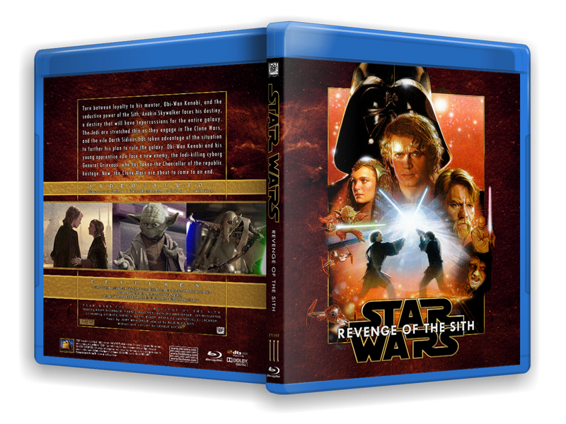
Drew's original on the left, the theatrical poster center, Drew's patch on the right.

Noone ever saw the original poster, it was altered before it reached the public, so there is actually just one poster out there. Drew showed the original in his "Art of Drew Struzan" book, where I first read about this.

What happened was, the marketing people wanted Darth to be bigger. As usual they spring this on Drew at the last minute and he had to paint them a patch to photoshop in after-the-fact. There was no room at the top, so the PR guys just decided to push everything down. What was once a nicely balanced bullseye composition is now bottom-heavy with tiny figures. They even used Darth's old shoulderline with the new head.

I think the dearest casualty is the aforementioned border that is present on all the other posters.

For my cover, I extended Darth's helmet from the original poster using the patch.
  Reply With Quote
Old 08-02-2011, 09:58 PM   #7205
Cowboy Cowboy is offline
Banned
 
May 2011
Garland, Texas
116
1
Default

Quote:
Originally Posted by Nissen View Post
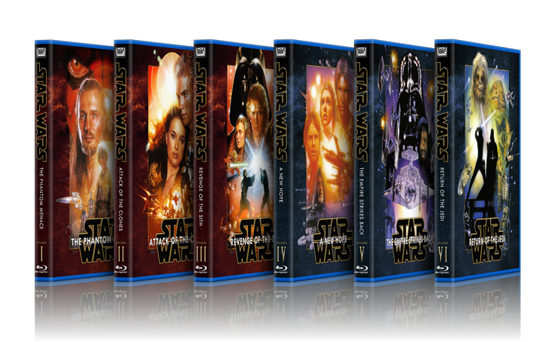
I said to myself, I'm not gonna do a Star Wars set. Everyone else is doing it. And if I WAS gonna do a Star Wars set, I certainly wasn't doing a Drew set. Everyone is doing a Drew set...

*sigh*


Seeing as I am the biggest Star Wars nerd on the Northern Hemisphere (check out my Star Wars Video collection at http://www.swonvideo.com) I just couldn't help myself.

It HAD to be the Drew Struzan posters. For one thing, that's about the only set that unifies all six movies. Mixing and matching posters from several different artists makes it difficult to make a cohesive set. Then there's the fact that the Drew posters are bloody excellent (almost, but I'll get to that later).

I usually start off these ramblings by complaining there's a lack of available Hi-rez images on the net for my projects. Well, for Star Wars there's a tonne of it. Still, I wanted to have textless versions of the posters to work with, and I needed to modify them so I wanted as much resolution as possible. I cracked open my Drew artbooks and scanned the posters myself. Some of them didn't fit the scanner so I had to scan in segments and stitch them together afterwards. I also wanted the original, unaltered version of Drew's Ep.3 poster and that is nowhere to be found online. It took me a day (out of three working on this project), but in the end I had pristine, 600dpi scans of the posters to sink my teeth into.

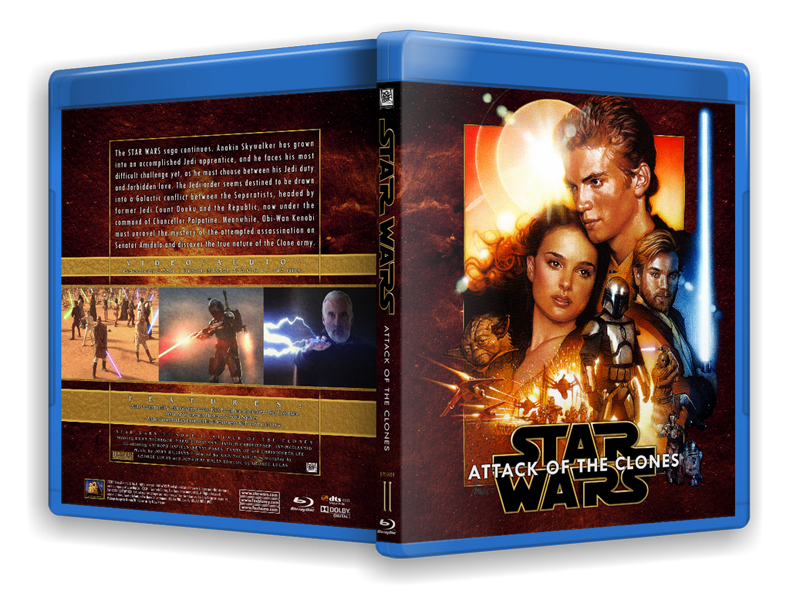
The challenge with the Drew posters is that they are formatted to fit a rectangular theatrical poster, which doesn't really fit the almost square front of a Blu-Ray cover. I see a lot of custom conversions of the Drew posters struggle with this, so I first had to modify all six posters to fit the proportions of Blu-Ray. Luckily, Drew included a rectangular frame in all the posters' design, so I used that as a starting point. I had to cut off some ships and characters from the bottoms of all the posters, and move the bottom frame up. I formatted all six posters to have an identical frame size, doing my best to preserve as much of the original compositions as possible. (Lopping of the bottom third of all the posters throws them somewhat out of whack, the center being lost, but they still work.) I discovered that Drew had been somewhat inconsistent with the size of those frames, especially between the original trilogy and the prequel trilogy posters, so that proved quite a challenge. To cap off the artwork and make it seem like it was originally finished at the bottom, I added a gold frame. This frame also replaced all the different frames between the posters, thus making them more of a unified whole.

As has been mentioned elsewhere, the Episode 3 poster does not have the same, obvious frame around it as the other posters do. Well, not the commercially released posters anyway. I had to go back to Drew's original version for Ep.3's poster, predating the hackjob the marketing gerbils did on it to squeeze a larger Darth Vader in there. Drew's version of the poster had the frame just fine.

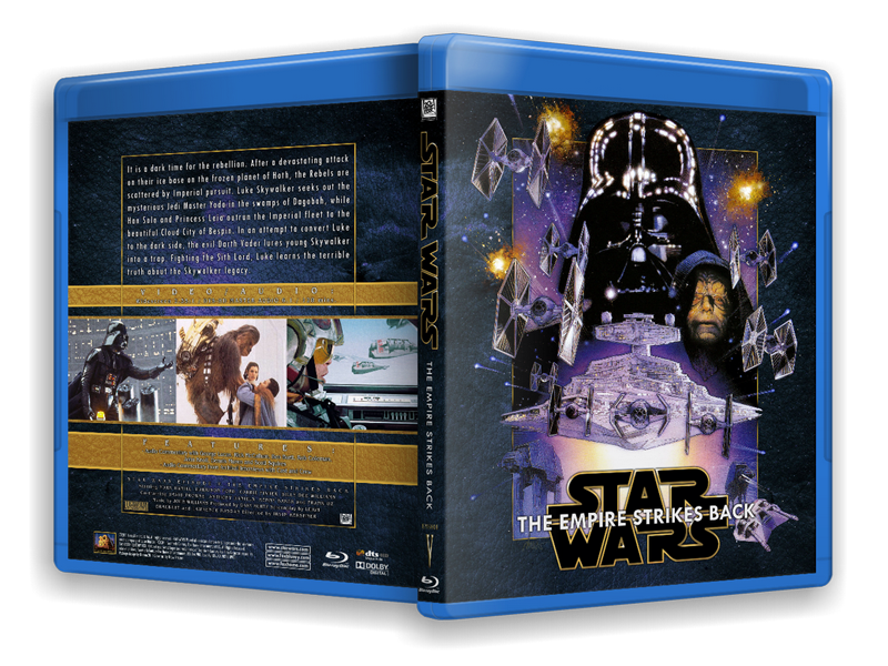
Originally I was doing black covers for these, because black is the only single colour that goes with all six posters. The prequels are rendered in warm, golden tones while the original trilogy posters are colder. I found the black background to be bland in the extreme, so I decided to do a textured, coloured background instead. I tried to make all the covers crimson/gold, but ultimately I had to split up the set in two sections using blue as a background for eps. 4-6. I would have preferred them all to be the same base colour since it brings all the spines together beautifully, but I wasn't going to settle for black. No way.

For the background I used a NASA still of a Nova, tilted it on it's side and duplicated it back and front. To give it some texture I overlaid a leather texture image I googled. The Nova already had the red/golden hues I was looking for so I didn't need to modify that for the prequels. For the OT, I shifted the hue and saturation of the Nova towards a pale blue.

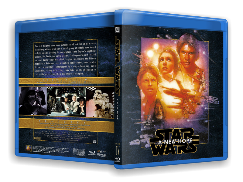
The one-sheets had to be isolated from their background to seamlessly fit on the covers. I used the colour-selection tool to isolate most of the blacks, then touched up the finished mask by hand. A lot of work, and I bet everyone takes it for granted. This removed Drew's signature for all the paintings, and I wanted to retain that, so I isolated his signature from the Ep.4 poster and put it on a separate layer from the artwork. That way it is consistent between all the posters. I found myself masking out most of Drew's paint-splatter stars, as they were conflicting with the stars from the Nova background, and frankly some of them just look like schmutz.

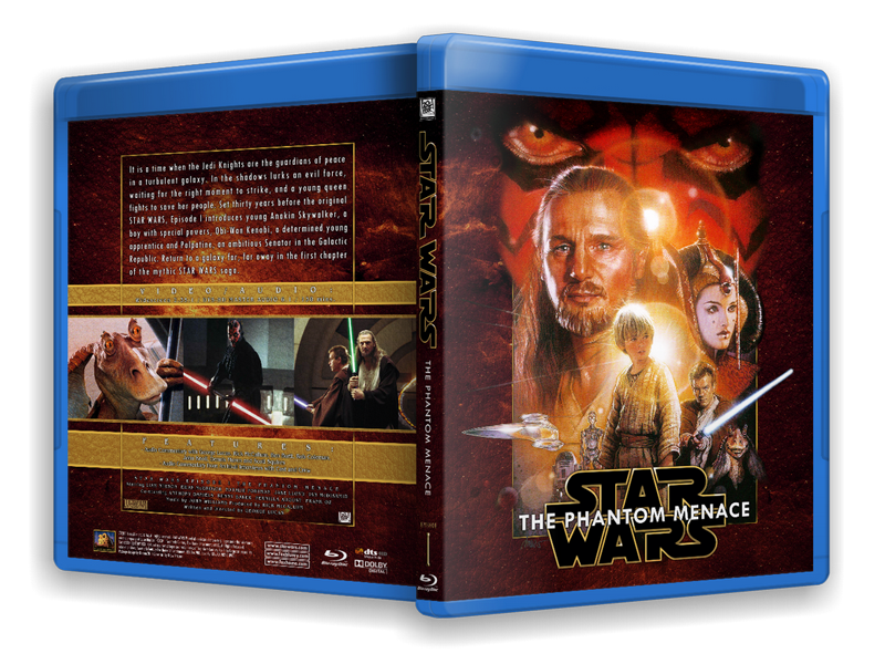
I mentioned a reservation about these posters' greatness earlier, and to me, the posters for Eps 1, 2 and 4 are just too hot, colourwise. It may just be in the way they are printed, but I toned down the redish skin on all of them. I still couldn't approximate anything approaching natural skin tones for Qui Gon on the first poster. I know it irks Drew when someone second guesses his choices (as would any artist) but I took that liberty. For Obi-Wan's lightsaber on the Ep.1 poster I replaced it with the one from the Ep.2 poster. It's still all Drew artwork, but that feeble, anemic, pointy lightsaber from the Ep.1 poster had to go.

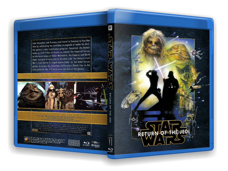
When making a set, as opposed to a single cover, I want to remain as consistent between covers as possible. This poses certain challenges when the artwork on all is going to be different. When placing the Star Wars logo on the front, I had to find a position that would remain the same across all covers, yet not obscure anything important on the different posters. I was largely successful, but poor Boba Fett got shafted on the Jedi cover. It just couldn't be helped. (Actually it could, I could have moved him to a different part of the painting, but I am just too knackered to perform that kind of precision surgery.)

The logo I opted for is one I first saw a year or so back, a slightly modernized version of the standard logo. I can't for the life of me find out who made it, but I see it used on the wallpaper sites everywhere. Anyone recognize it? It had to be a stacked version for the front, a horizontal version would obscure too many elements on the posters. For the spine I split it up and modified the leg of the "R" to follow the lines of the following "W". It's just a small thing, but it seemed in keeping with the other letters. I redrew the entire logo with the same gold/brown I used for the poster borders. I put in some shadow and highlight effects by hand to make it a little richer looking. I used that same colour for other elements on the spine and back, to tie the whole thing together.

For the actual titles of the films, I used a sans-serif font to complement the logo. It had to be readable against the logo, so I used a black glow effect to make it stand out more. I use the glow effect a lot when I need the text to be legible against a busy background. I find using a glow is more flexible than a standard stroke around the letters. The same font was then used for the text on the spines. Consistency is the word.

The roman numerals on the spine are rendered with the Emboss and Satin blending options from the layer pallette, as is the word "Episode". The titles themselves are so wordy, there's hardly room for much else on the spines.

The backs would be identical for all six, so once I established that template, it was just a matter of plopping in the images in their assigned placement and size. I still struggle with the backs, so I made three versions of them before I was satisfied. They're still a bit "boxy", and I am ambivalent about the gold frame I used, but it ties the back and front together so beautifully. The gold and crimson theme I used made the covers seem a bit excessively ornamental, sort of like baroque art. This called for a slightly elegant font for the specs (I believe I used Bangle, don't quote me on that because I can't be bothered opening the PSD files to check). For the summary I used a narrow sans-serif font ("TW Cent" something...) to set it apart from the other text on the back. Typography doesn't come naturally to me, so maybe these mixes clash to a more trained eye. Let me know, OK?

BTW, where do you guys take the summary blurb from? I always use what's on the official releases, in this case the DVDs, and just add or subtract text to fit my needs (and remove the worst spoilers). This is where typos creep in, so if there are any, do let me know. Good thing a scan of the actual Blu-Ray back surfaced, so I could get the specs and running times right.

When choosing images for the back I wanted to, like I always do, feature as many different characters as possible. I made a point of including Jar-Jar for the first one. It's kind of tongue-in-cheek, but also that I feel sorry for the guy getting the short end of the stick from everyone. I like him just fine, and if there was room I'd have put him on the spine just to spite the haters. That's also why the Ewoks are centered on the Jedi cover. Come on, who doesn't love the Ewoks? Really. I mixed some lesser known photos with the same, stale PR photos we've seen in every article about Star Wars for the last thirty years. Usually I'd avoid them like the plague, but that Falcon cockpit shot from ANH is pure nostalgia.

As always I used Illest Villains template for this, but for once I redid the legal copy to reflect the actual Star Wars property. I added the artwork credit for Drew Stuzan, as well as a Package Design credit for myself.

That's it. Took me three whole days. A custom three-disc for the bonus discs is forthcoming, but for now this is all I have. If you appreciate these long write-ups for my covers, let me know. I enjoy writing about them just as much as making them. I'd love to read about other designers' processes as well.

Okay, High Rez JPEGs of these are available by PM.
Those are nice. I personally dont care for the Struzan art for the OT but it does match the PT. Jung's poster for ANH and Empire Style A will always be my fav.
  Reply With Quote
Old 08-02-2011, 10:09 PM   #7206
Byte19 Byte19 is offline
Active Member
 
Byte19's Avatar
 
Jan 2011
Gotham City
15
706
54
1
Default

Quote:
Originally Posted by dv8pdx View Post
I've done a few. Here is one I did for a contest for Star Trek 12 when the rumor was flying around that it would be a remake of "the Wrath of Khan".
Quote:
Originally Posted by Blu Lemmy View Post
^ Nice, being a Trek fan i can appreciate that
well I can't appreciate it... not at all...


*pulls a gun on dv8* HANDS UP!!! GIMMIE THAT BEAUTIFUL POSTER NOW!!!!!!
  Reply With Quote
Old 08-02-2011, 10:31 PM   #7207
tkdkid717 tkdkid717 is offline
Senior Member
 
Oct 2009
199
15
Default

Im currently working on a Limitless cover.
  Reply With Quote
Old 08-02-2011, 10:34 PM   #7208
Trekkie313 Trekkie313 is offline
Blu-ray Baron
 
Trekkie313's Avatar
 
Nov 2010
Ohio
2
206
1650
547
156
5
59
Default

Quote:
Originally Posted by dv8pdx View Post
I've done a few. Here is one I did for a contest for Star Trek 12 when the rumor was flying around that it would be a remake of "the Wrath of Khan".
I'm ****ing jealous.
  Reply With Quote
Old 08-02-2011, 10:50 PM   #7209
dvdmike dvdmike is offline
Banned
 
Jun 2010
1069
Default


Attack Of The Clones Struzan

Download
http://img847.imageshack.us/img847/1796/swattack.jpg


Attack Of The Clones Teaser Alt.


Download
http://img405.imageshack.us/img405/2245/swattkkack.jpg

Last edited by dvdmike; 08-02-2011 at 10:56 PM.
  Reply With Quote
Old 08-02-2011, 10:54 PM   #7210
dvdmike dvdmike is offline
Banned
 
Jun 2010
1069
Default

Quote:
Originally Posted by Nissen View Post


Drew's original on the left, the theatrical poster center, Drew's patch on the right.

Noone ever saw the original poster, it was altered before it reached the public, so there is actually just one poster out there. Drew showed the original in his "Art of Drew Struzan" book, where I first read about this.

What happened was, the marketing people wanted Darth to be bigger. As usual they spring this on Drew at the last minute and he had to paint them a patch to photoshop in after-the-fact. There was no room at the top, so the PR guys just decided to push everything down. What was once a nicely balanced bullseye composition is now bottom-heavy with tiny figures. They even used Darth's old shoulderline with the new head.

I think the dearest casualty is the aforementioned border that is present on all the other posters.

For my cover, I extended Darth's helmet from the original poster using the patch.
Nearly all the copies now have the pen lines and brush strokes shopped out
  Reply With Quote
Old 08-02-2011, 11:39 PM   #7211
Tachaeon Tachaeon is offline
Member
 
Jan 2011
553
44
1
Default

hey Nissen do you have plans to update the Conan covers?
  Reply With Quote
Old 08-02-2011, 11:56 PM   #7212
huanz huanz is offline
Active Member
 
huanz's Avatar
 
Mar 2010
2
16
21
Default

Quote:
Originally Posted by dv8pdx View Post
Here are the finals. Not 100% happy, but Im done.

Download


Download
nice work dv8pdx
  Reply With Quote
Old 08-03-2011, 12:03 AM   #7213
Dynamo of Eternia Dynamo of Eternia is offline
Blu-ray Knight
 
Dynamo of Eternia's Avatar
 
Dec 2007
335
1857
1573
3
Default

Quote:
Originally Posted by Nissen View Post
I said to myself, I'm not gonna do a Star Wars set. Everyone else is doing it. And if I WAS gonna do a Star Wars set, I certainly wasn't doing a Drew set. Everyone is doing a Drew set...
[Show spoiler]
*sigh*


Seeing as I am the biggest Star Wars nerd on the Northern Hemisphere (check out my Star Wars Video collection at http://www.swonvideo.com) I just couldn't help myself.

It HAD to be the Drew Struzan posters. For one thing, that's about the only set that unifies all six movies. Mixing and matching posters from several different artists makes it difficult to make a cohesive set. Then there's the fact that the Drew posters are bloody excellent (almost, but I'll get to that later).

I usually start off these ramblings by complaining there's a lack of available Hi-rez images on the net for my projects. Well, for Star Wars there's a tonne of it. Still, I wanted to have textless versions of the posters to work with, and I needed to modify them so I wanted as much resolution as possible. I cracked open my Drew artbooks and scanned the posters myself. Some of them didn't fit the scanner so I had to scan in segments and stitch them together afterwards. I also wanted the original, unaltered version of Drew's Ep.3 poster and that is nowhere to be found online. It took me a day (out of three working on this project), but in the end I had pristine, 600dpi scans of the posters to sink my teeth into.

The challenge with the Drew posters is that they are formatted to fit a rectangular theatrical poster, which doesn't really fit the almost square front of a Blu-Ray cover. I see a lot of custom conversions of the Drew posters struggle with this, so I first had to modify all six posters to fit the proportions of Blu-Ray. Luckily, Drew included a rectangular frame in all the posters' design, so I used that as a starting point. I had to cut off some ships and characters from the bottoms of all the posters, and move the bottom frame up. I formatted all six posters to have an identical frame size, doing my best to preserve as much of the original compositions as possible. (Lopping of the bottom third of all the posters throws them somewhat out of whack, the center being lost, but they still work.) I discovered that Drew had been somewhat inconsistent with the size of those frames, especially between the original trilogy and the prequel trilogy posters, so that proved quite a challenge. To cap off the artwork and make it seem like it was originally finished at the bottom, I added a gold frame. This frame also replaced all the different frames between the posters, thus making them more of a unified whole.

As has been mentioned elsewhere, the Episode 3 poster does not have the same, obvious frame around it as the other posters do. Well, not the commercially released posters anyway. I had to go back to Drew's original version for Ep.3's poster, predating the hackjob the marketing gerbils did on it to squeeze a larger Darth Vader in there. Drew's version of the poster had the frame just fine.

Originally I was doing black covers for these, because black is the only single colour that goes with all six posters. The prequels are rendered in warm, golden tones while the original trilogy posters are colder. I found the black background to be bland in the extreme, so I decided to do a textured, coloured background instead. I tried to make all the covers crimson/gold, but ultimately I had to split up the set in two sections using blue as a background for eps. 4-6. I would have preferred them all to be the same base colour since it brings all the spines together beautifully, but I wasn't going to settle for black. No way.

For the background I used a NASA still of a Nova, tilted it on it's side and duplicated it back and front. To give it some texture I overlaid a leather texture image I googled. The Nova already had the red/golden hues I was looking for so I didn't need to modify that for the prequels. For the OT, I shifted the hue and saturation of the Nova towards a pale blue.

The one-sheets had to be isolated from their background to seamlessly fit on the covers. I used the colour-selection tool to isolate most of the blacks, then touched up the finished mask by hand. A lot of work, and I bet everyone takes it for granted. This removed Drew's signature for all the paintings, and I wanted to retain that, so I isolated his signature from the Ep.4 poster and put it on a separate layer from the artwork. That way it is consistent between all the posters. I found myself masking out most of Drew's paint-splatter stars, as they were conflicting with the stars from the Nova background, and frankly some of them just look like schmutz.

I mentioned a reservation about these posters' greatness earlier, and to me, the posters for Eps 1, 2 and 4 are just too hot, colourwise. It may just be in the way they are printed, but I toned down the redish skin on all of them. I still couldn't approximate anything approaching natural skin tones for Qui Gon on the first poster. I know it irks Drew when someone second guesses his choices (as would any artist) but I took that liberty. For Obi-Wan's lightsaber on the Ep.1 poster I replaced it with the one from the Ep.2 poster. It's still all Drew artwork, but that feeble, anemic, pointy lightsaber from the Ep.1 poster had to go.

When making a set, as opposed to a single cover, I want to remain as consistent between covers as possible. This poses certain challenges when the artwork on all is going to be different. When placing the Star Wars logo on the front, I had to find a position that would remain the same across all covers, yet not obscure anything important on the different posters. I was largely successful, but poor Boba Fett got shafted on the Jedi cover. It just couldn't be helped. (Actually it could, I could have moved him to a different part of the painting, but I am just too knackered to perform that kind of precision surgery.)

The logo I opted for is one I first saw a year or so back, a slightly modernized version of the standard logo. I can't for the life of me find out who made it, but I see it used on the wallpaper sites everywhere. Anyone recognize it? It had to be a stacked version for the front, a horizontal version would obscure too many elements on the posters. For the spine I split it up and modified the leg of the "R" to follow the lines of the following "W". It's just a small thing, but it seemed in keeping with the other letters. I redrew the entire logo with the same gold/brown I used for the poster borders. I put in some shadow and highlight effects by hand to make it a little richer looking. I used that same colour for other elements on the spine and back, to tie the whole thing together.

For the actual titles of the films, I used a sans-serif font to complement the logo. It had to be readable against the logo, so I used a black glow effect to make it stand out more. I use the glow effect a lot when I need the text to be legible against a busy background. I find using a glow is more flexible than a standard stroke around the letters. The same font was then used for the text on the spines. Consistency is the word.

The roman numerals on the spine are rendered with the Emboss and Satin blending options from the layer pallette, as is the word "Episode". The titles themselves are so wordy, there's hardly room for much else on the spines.

The backs would be identical for all six, so once I established that template, it was just a matter of plopping in the images in their assigned placement and size. I still struggle with the backs, so I made three versions of them before I was satisfied. They're still a bit "boxy", and I am ambivalent about the gold frame I used, but it ties the back and front together so beautifully. The gold and crimson theme I used made the covers seem a bit excessively ornamental, sort of like baroque art. This called for a slightly elegant font for the specs (I believe I used Bangle, don't quote me on that because I can't be bothered opening the PSD files to check). For the summary I used a narrow sans-serif font ("TW Cent" something...) to set it apart from the other text on the back. Typography doesn't come naturally to me, so maybe these mixes clash to a more trained eye. Let me know, OK?

BTW, where do you guys take the summary blurb from? I always use what's on the official releases, in this case the DVDs, and just add or subtract text to fit my needs (and remove the worst spoilers). This is where typos creep in, so if there are any, do let me know. Good thing a scan of the actual Blu-Ray back surfaced, so I could get the specs and running times right.

When choosing images for the back I wanted to, like I always do, feature as many different characters as possible. I made a point of including Jar-Jar for the first one. It's kind of tongue-in-cheek, but also that I feel sorry for the guy getting the short end of the stick from everyone. I like him just fine, and if there was room I'd have put him on the spine just to spite the haters. That's also why the Ewoks are centered on the Jedi cover. Come on, who doesn't love the Ewoks? Really. I mixed some lesser known photos with the same, stale PR photos we've seen in every article about Star Wars for the last thirty years. Usually I'd avoid them like the plague, but that Falcon cockpit shot from ANH is pure nostalgia.

As always I used Illest Villains template for this, but for once I redid the legal copy to reflect the actual Star Wars property. I added the artwork credit for Drew Stuzan, as well as a Package Design credit for myself.
Wow! These turned out GREAT! Normally I would prefer OT covers based on the original posters, but the Struzan ones are perfect here. I really like what you did with them. It is kind of cool how they all of a cohesive look, but with the color differences the prequel and original trilogies are kind of separated. And I enjoyed your write up about the thought process that went into all of this. Excellent job! I already sent you a PM requesting these!

Quote:
That's it. Took me three whole days. A custom three-disc for the bonus discs is forthcoming, but for now this is all I have. If you appreciate these long write-ups for my covers, let me know. I enjoy writing about them just as much as making them. I'd love to read about other designers' processes as well.
Out of curiosity, what kind of color scheme are you going to use for the bonus content case? This is just some friendly advise (feel free to ignore it), but I think it would be cool if the bonus disc case kind of a had a dark green-ish coloring to it. I just think it would be best (whatever color is chosen) not to use either of the exact color schemes that you used for the two trilogies. It will help maintain the balance between the two sets.

Would there be any chance of you making a version of the bonus content case that will hold 6 discs? It will be cool for those of us planning to put some of the bonus content DVDs in the case as well. If not, no big deal.
  Reply With Quote
Old 08-03-2011, 01:10 AM   #7214
Nissen Nissen is offline
Special Member
 
Nissen's Avatar
 
May 2010
3
Default

Quote:
Originally Posted by Tachaeon View Post
hey Nissen do you have plans to update the Conan covers?
In the works. I just need someone who has the discs to PM me the U.S. specs, list of extras, exact runtime etc. for both Barbarian and Destroyer
  Reply With Quote
Old 08-03-2011, 01:13 AM   #7215
Nissen Nissen is offline
Special Member
 
Nissen's Avatar
 
May 2010
3
Default

Quote:
Originally Posted by Dynamo of Eternia View Post
Out of curiosity, what kind of color scheme are you going to use for the bonus content case? This is just some friendly advise (feel free to ignore it), but I think it would be cool if the bonus disc case kind of a had a dark green-ish coloring to it. I just think it would be best (whatever color is chosen) not to use either of the exact color schemes that you used for the two trilogies. It will help maintain the balance between the two sets.

Would there be any chance of you making a version of the bonus content case that will hold 6 discs? It will be cool for those of us planning to put some of the bonus content DVDs in the case as well. If not, no big deal.
Agreed on the bonus disc being a different colour. Not green, maybe grey. Sorry to say the bonus case will be for the BD extras only. Bartlett's been there, done that :-)
  Reply With Quote
Old 08-03-2011, 01:17 AM   #7216
Ups-Charger Ups-Charger is offline
Active Member
 
Ups-Charger's Avatar
 
Aug 2010
Bartlett, IL
845
1
Default

Stellar work on those starwars covers nissen. Love 'em
  Reply With Quote
Old 08-03-2011, 01:43 AM   #7217
HD 335 HD 335 is offline
Power Member
 
HD 335's Avatar
 
Jan 2008
Texas
33
408
1269
16
3
2
121
Default

Very nice dv8pdx! Your work on the covers has always been fantastic and posters art follow the same vein.

Quote:
Originally Posted by dv8pdx View Post
I've done a few. Here is one I did for a contest for Star Trek 12 when the rumor was flying around that it would be a remake of "the Wrath of Khan".
[Show spoiler]
  Reply With Quote
Old 08-03-2011, 04:06 AM   #7218
tkdkid717 tkdkid717 is offline
Senior Member
 
Oct 2009
199
15
Default


Finished!!
  Reply With Quote
Old 08-03-2011, 05:09 AM   #7219
dv8pdx dv8pdx is offline
Expert Member
 
dv8pdx's Avatar
 
Feb 2008
Portland Oregon
150
Default

ok, with the rumors floating around that CBS got the funding to actually create Star Trek: The Next Generation in Hi-Def in the same order as they did with TOS - I thought I'd give the series a try for a cover. Very generic, LCARS fashioned, each season is mono-toned in a specific color, which I still have to mute a little more on season 2 and 3. Here is what the season set looks like so far. I still have to update episodes.


Last edited by dv8pdx; 08-03-2011 at 10:09 AM.
  Reply With Quote
Old 08-03-2011, 09:26 AM   #7220
gregmasciola gregmasciola is offline
Special Member
 
May 2008
55
539
454
11
Default

Quote:
Originally Posted by Nissen View Post
I said to myself, I'm not gonna do a Star Wars set. Everyone else is doing it. And if I WAS gonna do a Star Wars set, I certainly wasn't doing a Drew set. Everyone is doing a Drew set...
*sigh*

[Show spoiler]


I love these! They're awesome covers! Great job using the original ROTS poster, too.
  Reply With Quote
Reply
Go Back   Blu-ray Forum > Movies > Blu-ray Movies - North America

Similar Threads
thread Forum Thread Starter Replies Last Post
Custom cover art for Blu-ray printing thread General Chat bpmford 81 04-29-2024 11:54 PM
Official Custom SteelBook™ Cover Art Thread Blu-ray SteelBooks jamesaevans 265 05-05-2019 02:29 AM
Official Custom Cover Art Thread(Archived Posts) Blu-ray Movies - North America Trean 2598 05-21-2009 07:22 AM
Custom Cover Art - Questions About... Blu-ray Movies - North America Trean 0 05-15-2009 05:19 AM

Tags
art, cover, cover art, coverart, insert, print, printer


Posting Rules
You may not post new threads
You may not post replies
You may not post attachments
You may not edit your posts

BB code is On
Smilies are On
[IMG] code is On
HTML code is Off

Forum Jump


All times are GMT. The time now is 10:35 AM.