Quote:
Originally Posted by Natty

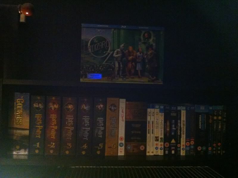
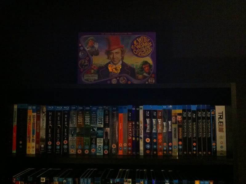
It is a small font size I must admit, it is more because the longest title I have (Pirates of the Carribean: The Curse of the Black Pearl) will fit perfectly down the spine in that size.
I kind of like the ratings logos, but I wouldn't miss them if I decided against them. I just think the bottom of the spine would look very empty haha.
Thanks for your input  It has been taken on board! |
I think they look great. If you're after high-res BBFC certificates go to
Wikipedia, they have massive ones there which you can scale down.
As for the uniformity I really would have liked some kind of standard to have been introduced, it works with console games and depending on tastes you could have the movie logo or just plain text.
I think the Wii games look pretty good, they centre the text and it changes in size depending on title, plus you could 'borrow' that little coloured triangle as a genre key for your collection. There's probably a basic studio label (just one colour) for each studio, I know Fox, Optimum, Universal and Paramount have them. You could even change the colours on those for your genres.
coverexample1.jpg
coverexample2.jpg
I do like the simplicity of your designs though!
Can you post a picture of the Watchmen cover? It would be nice to see it all printed out!
")
")
")
")
")
")
")
")
")
")
")
")


 Linear Mode

