Quote:
Originally Posted by Nissen

Some friendly advice, eh?
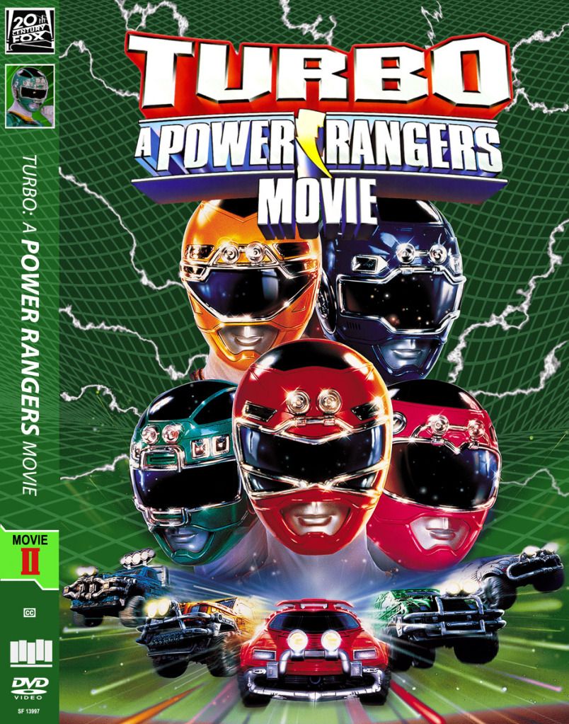
Well, I think the second one works best, because the perspective vanishing point of the grid mesh more closely matches the vanishing point on the speeding cars, and the vanishing point on the title treatment. In the first version they are going off in all different directions.
Does the mesh have a significance to the actual film? Otherwise, I would replace it with something else, light streaks, a cloud texture or other atmospheric, smoky background. It would go better with the lightning too. I just think the grids look so mechanical and "hard" for lack of a better word.
Either way, these look very professional and that's a compliment.
|
The mesh/grid look doesn't really have any significance to the film, itself.
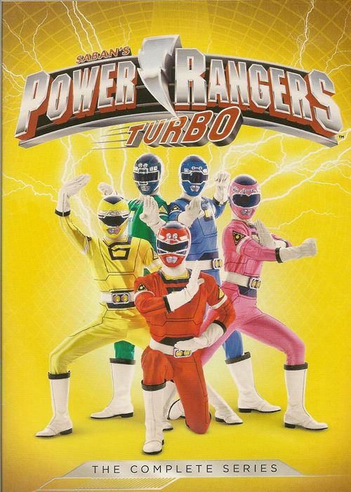
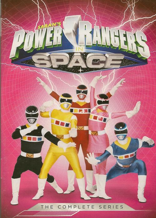
But, recently Time Life and Shout Factory released the first 7 seasons of Power Rangers which can be ordered through time life. Seasons 1-3 are the "Might Morphin" seasons, and have their own slip-box, and a certain style. Season 4-7 (which is the start of when the title would change each year to Power Rangers: [insert subtitle here]) have a somewhat different look, including a grid background. And each season is "themed" off of a different color of Ranger. So, I'm basing this around the Green Ranger from the movie since none of the sets are themes around that color.
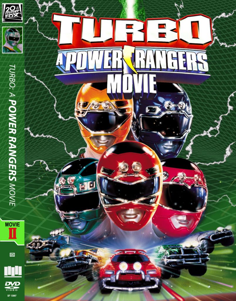
My goal here is to make custom covers for the two movies to make them match up with these sets (this is the 2nd movie which takes place in between seasons 4 and 5, so I'm making it match those sets... the first Film will match the Seasons 1-3 look).
The biggest issue for me has been find grid patterns that work and match up. I have no idea how to even go about creating something like that in photoshop (the grid), so I had been searching online. I wasn't coming up with anything great (the previous one that I was working with, which I think is posted elsewhere in this thread, just looked terrible), but then I saw some video online and it gave me a great idea of search for wormholes instead (as the graphical representation of wormholes in space has a similar look to what I was looking for). Even though this still doesn't exactly match up with the season sets, it's still a lot better. I'm also willing to let the movies (particularly on the front covers) vary a bit from the season set look to have them stand out.
Here's a couple of the front covers from the 4-7 set:
And here's the spines of seasons 4-7 (this was captured from a youtube video, so the quality isn't that great):
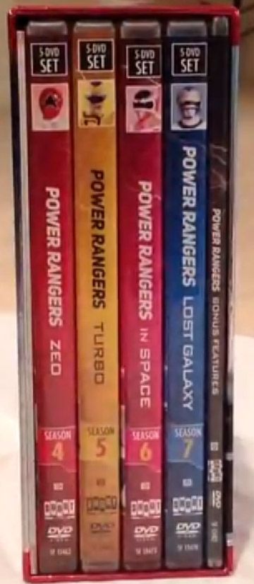
So, what I'm trying to do is make this match up. That's why I put "Movie II" in place of the season number, and the black and white 20th century fox logo in the same place as the boxes that say the number of discs for each set.
Getting back to the grid pattern background, like I said, I didn't make it from scratch, I just recolored it and deleted the black background that was around it. I'm conflicted on which version to use. The second image from my previous post is the grid in it's original shape (just resized, recolored, etc). The thing that bugs me about it is that for the upper portion of it (above the "horizon", if you will) it's curving inward more so than outward. I was trying to get it a
little closer to that outward radiating look of the grid patterns on the season sets, even though it still wouldn't be exactly the same.
So, with the first image from my previous post, I actually took the original grid image, cut it in half, and flipped the two halves around to try and sort of get the opposite effect. Where the two halves actually meet didn't match up correctly, of course, so that's why I added that green beam of energy above the title to hide that. I have mixed feelings on the result. I do agree that it makes the pattern look 'off' in some respects. Obviously wear the two halves meet wouldn't make a perfectly round shape, but it still go the effect that I was going for a little bit better.
And I'm actually conflicted as to which version of the lower portion I like better. I do agree with you about how in the 2nd version, the lower portion matches up with the vanishing point of the cars and the title better. At the same time, what I like about the first version is how the lower portion looks in respect to the Rangers' heads. I like how it kind of 'vanishes' behind the yellow and blue ranger's heads.
And something really bugs me for some reason about the way the grid pattern looks above the title on the 2nd version. I may try putting in the green energy beam over it and see if the breaks up the monotony, even though I don't "need" it to hide anything like I did in the first version.
Ah, conflicts!

Thanks for the compliments about the professional look of it!

It means a lot coming from you given all that you've done and are capable of. I know my skills aren't up there with many others, and I'm also using a rather old version of Photoshop, but I'm trying to improve!
I do find it funny that I'm putting this much effort into something like Power Rangers.

")
")
")
")
")
")
")
")
")
")
")
")


 Linear Mode

