Quote:
Originally Posted by madlost1

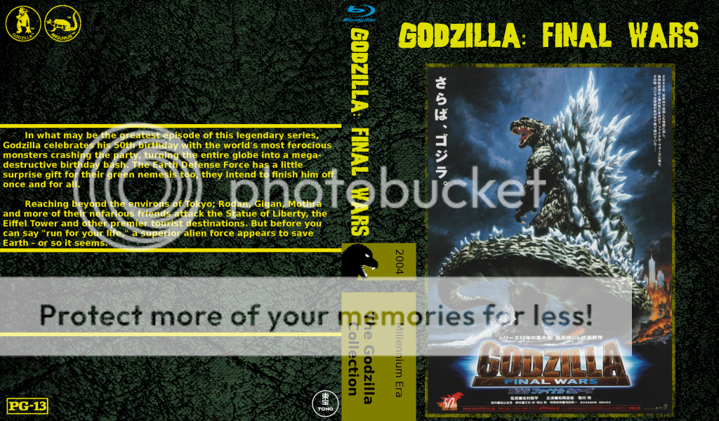
Started working on my custom Godzilla series covers today. I really liked the design that Section 23 is using for their Godzilla releases and wanted to keep in that spirit. I am trying to use original poster art as much as possible as long as I like the design. Above the poster art area will be the title of the film in English along as on the spine. While some have English titles already on the poster like the below example I want to keep it uniform throughout the series. I also took some design elements from the good folks at Criterion and adapted them for use on my covers here and they will be housed in criterion style blu cases. I'm nowhere near as skilled as most of you guys but hopefully these will turn out okay. Here's what I have done so far.
 |
Do you mind if I give some constructive criticism?
I'm by no means a pro, so take it all for what it is...
First, and most glaringly to me is the title being on the front cover twice and in different styles. I'd maybe try centering the original poster art in the frame and just going that route. It would clean it up a bit.
Second, the spine becomes very cluttered looking with all of the different colors and logos and pictures and everything. If you insist on having the blue Blu-ray logo AND the Criterion-esque box, I'd consider either rotating the Blu-ray logo so that it goes in the same direction as the words OR rework the box and put the Blu-ray logo at the bottom of the spine OR just lose it all together and move it to a small corner in the back.
Lastly, I'd play around with fonts a bit more and maybe give yourself a little bit more distance from the edge of the cover, when that prints out the words are going to be right at the edge.
Again, please don't take this as me slamming your work, because I think it could be really great with a few tweaks!
")
")
")
")
")
")
")
")
")
")
")
")


 Linear Mode

