Quote:
Originally Posted by Sukie

OMG... I have such a new found respect for all of you who make these fully official covers. I mean I don't quite make mine look totally official but it still take me quite some time to make one. I couldn't imagine how much time it would take for a full cover with all the specs....
So in saying this, I'm currently trying to come up with my own stamp on my covers and I think with your help, I can someday achieve that. For example... here are two covers for the same movie... I didn't like one so I made another... I think this will be in WIP forever. Anyways I would like your input as to which is better and why you chose that one.... please  |
It's been a lot of fun watching you grow and seeing you find your own style, I know first hand what it can be like to have what seems like a great idea in your head and not being able to make that idea come to fruition, but over time I've found my aesthetic and I can see that you are on your way down that path as well!
If official looking art is what you are going for, take a look at the official artwork you like and pick and choose the bits you like and try to replicate and eventually make them your own.
A few things I noticed on those WIP covers that you might want to try:
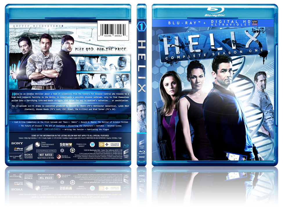
The barcode... If you want to include a barcode and you want it to look official, look at how barcodes are placed on official covers... They usually discount the art underneath of them (see the backs of JJ Abrahms Star Trek movies) OR they are made into quite a production and are included as part of a large banner (see most PIXAR releases), but they almost never are small inconspicuous bits that fit nicely into the artwork.
The faded screencap behind the text... while you may like the image, I'd suggest trying to incorporate it in a different way. And if you must use a screencap behind text, try avoiding covering crucial elements of the image with text.
The font... Play around with different fonts, sometimes when a font is too large it automatically looks cheapened and something as simple as shrinking the font down and filling in the space created with things such as screen caps or logos or specs can really add to the cover.
And the last thing I noticed that is a small detail that could make a big difference:
The formatting of the paragraphs... Try not to allow small words to stick out beyond a word in the line above or below it and in the last line of the paragraph, try to make sure that there are at least a couple of words (I find 1/4 the length of the rest of the lines at minimum is a good rule of thumb.) I'll post some examples below in the spoiler tags.
[Show spoiler]EXAMPLE 1:
The highly acclaimed director of Finding Nemo and the creative storytellers behind
Cars and Ratatouille transport you to a galaxy not so far away for a new cosmic
comedy adventure about a determined robot named WALL•E. Experience the exciting
animated hit film with theater-quality sound and the most pristine picture available on
Blu-ray.
(in the above example, "Blu-ray" is all by itself in the last line... try to avoid that, formatting the paragraph as seen below instead.)
The highly acclaimed director of Finding Nemo and the creative storytellers
behind Cars and Ratatouille transport you to a galaxy not so far away for a
new cosmic comedy adventure about a determined robot named WALL•E.
Experience the exciting animated hit film with theater-quality sound and the
most pristine picture available on Blu-ray.
(it suddenly looks much cleaner...)
Anyway... these are just a few things that helped me to learn over time. Take them for what you will, I realize these may not work for everybody, but try it out and see if you notice any improvement in your designs!
")
")
")
")
")
")
")
")
")
")
")
")


 Linear Mode

