|
|
![]() |
||||||||||||||||||||
|
Best Blu-ray Movie Deals
|
Best Blu-ray Movie Deals, See All the Deals » |
Top deals |
New deals
![]() ![]() ![]() ![]() ![]() ![]() ![]() ![]() ![]() ![]() ![]() ![]() |
![]() $27.13 2 hrs ago
| ![]() $27.57 3 hrs ago
| ![]() $24.96 22 hrs ago
| ![]() $44.99 | ![]() $29.99 14 hrs ago
| ![]() $31.13 | ![]() $30.50 9 hrs ago
| ![]() $34.99 1 day ago
| ![]() $54.49 | ![]() $29.95 | ![]() $70.00 | ![]() $34.99 |
![]() |
#1 |
Blu-ray Samurai
|
![]()
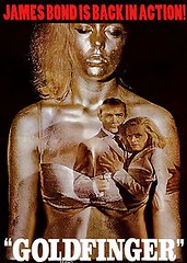
I have noticed for quite awhile that when some studios issue a Blu of a classic, they give it the blandest cover art ever. Bond films recently reflect this.
![]() ![]() ![]() ![]() Some smaller companies do use original poster art, which I am happy about, but major studios...? Last edited by bluskies; 10-24-2012 at 03:49 PM. |
![]() |
![]() |
#2 |
Blu-ray King
|
![]()
Who knows? Email MGM and find out.
|
![]() |
![]() |
#3 |
Special Member
|
![]()
Yeah, I hear ya. Warner does obtain some classic poster art for some of their older releases but we all know Criterion is where it's at. Also love the artwork for Shout Factory's recent horror releases like Halloween II.
|
![]() |
![]() |
#5 |
Special Member
|
![]()
they should follow Shouts lead and have the classic art reversible to the front. I did that with Piranha the other day. You can do that with most of their releases.
That way you can market to the greater audience and those in the audience can choose to reverse the cover if they want to. |
![]() |
![]() |
#7 |
Blu-ray Guru
|
![]()
They are trying to sell the film to as many people as possible. If a film looks obviously dated (by old fashioned cover art), it may (nay, will) turn off younger buyers for obvious reasons. If they can make it look fresh somehow, more modern, and more exciting, they will try. If they can trick someone walking through the store into thinking it is a newer film, they want to do that.
|
![]() |
![]() |
#9 | |
Special Member
|
![]() Quote:
The original artwork is usually too complex to be easily identified when printed at the small size of a BD case, at least by casual buyers. I know you, me, or mostly everybody on these boards are looking for a specific title when we go into a store, we don't need to be "attracted" by the cover or to identify it, we just need to locate it. Actually, we will buy the movie we want even if it has atrocious cover artwork. We are a "sure sell", so to speak. But they want the kind of people who enters a store (be it brick & mortar or online) undecided on what to buy, be it because it is a present for somebody else or an impulse buy or whatever, to be "lured" to their releases. And they know, the studios know, that the deciding factor may be as random as a combination of colors, the clear presence of some high-power Hollywood star, or a design that blatantly rips off some other movie to the extent that it will trick the buyer into thinking that the movie itself will be similar to that other one that he or she liked, so he/she will like this one too. It's just crass marketing at work, the key word here being "work", because I am afraid that, when it comes to the general, indiscriminate buyer target, studios are right and appealing to the lowest common denominator actually works, indeed. I am sure they have many surveys proving that sad fact. On the other hand, smaller labels dedicated to release more obscure, even cult titles, can afford to use the original artwork, because they are aware that their consumer target are specifically looking for their niche product, and it's the movie itself that sells it. Having said that, do they really need to be so, SO ugly, so amateurishly and poorly done so often? I don't think so. And please, don't misunderstand me and take this for a defense of all that, I am as disgusted by it as the next guy, and I can even be so anal about it that there are a few titles I have refused to buy because of that (CAMELOT digibook, someone...?). But that's the way it is. |
|
![]() |
![]() |
#10 |
Blu-ray Count
|
![]()
I agree 100% but out of the full collection of James Bond classic Movie posters, Goldfinger is the only one I pretty much can't stand. It's Yuk.
Look at Thunderball, Live and Let Die, even Octopussy,... those are awesome. They NEVER use movie poster art for James Bond on home video and it's always something I've corrected by printing custom covers. I don't like custom covers,... so I hate to bother but for The Bond movies it's a must. -Brian |
![]() |
![]() |
#12 |
Active Member
|
![]()
Sadly I've noticed that cover art is attempting too hard to look trendy, it's trying too hard, its basically become Ikea and Target...those Bond covers are a prime example they look like they could be a magazine cover for the Latte generation, it's an accessory, these companies could care less about the collector, to them these movies are product, not art, the people in charge of putting these movies out probably couldn't tell you the first thing about them, thats why we get sh*tty transfers worthless special features and slapped together cover art, for once I'd like to see some true movie fans running things, but that day will never come
|
![]() |
![]() |
#13 |
Blu-ray Prince
|
![]() |
![]() |
![]() |
#15 |
Blu-ray Baron
|
![]()
Chinatown is a good example of trying to do it the right way. The execution was perfect, but im sorry the drawings are terrible. Is that the "original" artwork or is that some "retro" idea of the flick?
I googled my own question. It is the original poster. well done. Glad they kept it. I still dont find it attractive. Last edited by Batmon77; 10-24-2012 at 04:29 PM. |
![]() |
![]() |
#16 | |
Blu-ray Samurai
|
![]() Quote:
Oh, for the days when film studios had entire art departments that turned out incredible poster art. They could even turn a schlocky horror film into something you wanted to go see because of the art. |
|
![]() |
![]() |
#17 | |
Blu-ray Samurai
|
![]() Quote:
|
|
![]() |
![]() |
#18 |
Blu-ray Ninja
|
![]()
I agree. Fox seem to be bad at this, just take a look at the Commando reissue. Goddam horrid
![]() ![]() Where the hell did they get that background from! The colours have no connection with what the film actually looks like. The original, on the other hand, yes looks dated but its in keeping with the film. You can tell just from the title that its from the 80's ![]() ![]() |
![]() |
![]() |
#20 |
Blu-ray Prince
|
![]()
It is also about marketing. The cover is not trying to sell the movie to current fans, they are already a captive market. Many casual consumers will simply buy a movie blind if they recognize a certain actor or actress on the cover, which is why bad photoshopped pictures are all the rage.
|
![]() |
|
|
![]() |
![]() |
|
|