|
|
![]() |
||||||||||||||||||||
|
Best Blu-ray Movie Deals
|
Best Blu-ray Movie Deals, See All the Deals » |
Top deals |
New deals
![]() ![]() ![]() ![]() ![]() ![]() ![]() ![]() ![]() ![]() ![]() ![]() |
![]() $82.99 1 day ago
| ![]() $74.99 | ![]() $22.95 11 hrs ago
| ![]() $27.99 6 hrs ago
| ![]() $41.99 3 hrs ago
| ![]() $19.96 5 hrs ago
| ![]() $7.00 1 hr ago
| ![]() $24.89 5 hrs ago
| ![]() $34.99 8 hrs ago
| ![]() $101.99 1 day ago
| ![]() $99.99 | ![]() $29.95 |
![]() |
#14121 |
Blu-ray Champion
|
![]()
It was overblown until the subtitles were green. Then, it becomes a slight problem, especially when in the rest of the trilogy the subtitles are white. But, the FELLOWSHIP EE is still the best looking film of the series, bar none.
|
![]() |
![]() |
#14122 | |
Blu-ray Grand Duke
|
![]() Quote:
Check out the Scanners Criterion thread, which is full of people who think it looks super dark and green because they keep flicking between caps with the brighter European releases, rather than watching the movie themselves, where it looks more or less bright, film-like and fine. |
|
![]() |
Thanks given by: | Geoff D (08-15-2015), HeavyHitter (08-14-2015) |
![]() |
#14123 | |
Blu-ray Samurai
|
![]() Quote:
And then the scenes from Fellowship of the Ring that are showed in the other two movies do NOT have the green tint, so it's a little weird. |
|
![]() |
Thanks given by: | frogmort (08-15-2015) |
![]() |
#14124 | |
Blu-ray Ninja
|
![]() Quote:
There are many people who can see the overall colour tone of an image without having to make side-by-side comparisons. If you can't, then fair enough. But a fair number, I would say, don't need comparative screenshots to see that the white points in that transfer are distinctly green, the greens themselves are overblown and warm colours like reds and browns are shifted towards a dingy grey. If you're happy with it, or even content, then again, fair enough. (Of course.) But that's no reason to make stuff up to disparage anyone who feels it fell short. |
|
![]() |
Thanks given by: | Biggiesized (09-10-2015), frogmort (08-15-2015) |
![]() |
#14125 |
Blu-ray Prince
|
![]()
The Shire to me went from nice and sunny to overcast and about to rain. I always watch the DVD of the EE of Fellowship.
|
![]() |
Thanks given by: | Biggiesized (09-10-2015) |
![]() |
#14126 |
Blu-ray Champion
|
![]()
It took me a while to realize that what really bothered me about EE FotR isn't so much the blanket green tint (which I could've done without), but the fact that it originally had some beautifully golden, sunny, bright scenes such as early on in The Shire, but now the whole movie is just overcast and dark.
The overall detail is much improved however, when it isn't black crushed in the darkest scenes such as The Mines of Moria. |
![]() |
![]() |
#14128 |
Blu-ray Samurai
|
![]()
I have always thought that the original dvd color grading was hideous. Rivendale is drowned in an ugly orange gold during the day making people look more like simpsons than living flesh and blood humans, and at night its drowned in blue with a shade of pink. Blue lorien looks like shit. The ugly over abundant blues in the opening prologue drowns out the golds on the armor entirely. The bubblegum pink skin tones at times look awful. Moria is blue, the light is blue, the floor is blue, even the torn out pages of the diary in Ballin's tomb are blue. Orthanc is blue inside. Pretty much everywhere there should have been black Jackson shifted it to blue.
I much prefer the updated color grading. Sure its got some crush here and there and leans green noticeably in a handful of spots but thats preferable to what was going on in the original grading. The gold details on the elven armor in the prologue actually stands out now. Rivendell is gorgeous and is made up of more than one color. Peoples skin doesnt look like its covered in blush. Lorien has a proper white ethereal glow and at the docks there is a light dawn glow as the fellowship is leaving. Moria is made up of greys, blacks, whites, and sepia tones. So rather than ever going back to the heavy handed color grading that Jackson did back in 2001 Id rather they just remove the crush and fix the spots that lean too far green but keep everything else exactly the way it is on the EE blu-ray. And yes I know that Fellowship's theatrical cinematography won an academy award. The academy isnt perfect and have made bad decisions more than once. While the camera work and shot composition in that film was probably deserving of an award, the color grading wasnt imo. Last edited by Cook; 08-15-2015 at 03:15 AM. |
![]() |
![]() |
#14129 | |||
Junior Member
Aug 2015
|
![]() Quote:
Quote:
Quote:
|
|||
![]() |
Thanks given by: | Deathbymonkeys (08-15-2015) |
![]() |
#14132 |
Blu-ray Ninja
|
![]()
I agree with those who prefer the EE colour grading. The EE release of The Fellowship is one my favourite Blu-ray's, it is not perfect, but for me, provides a very filmic experience.
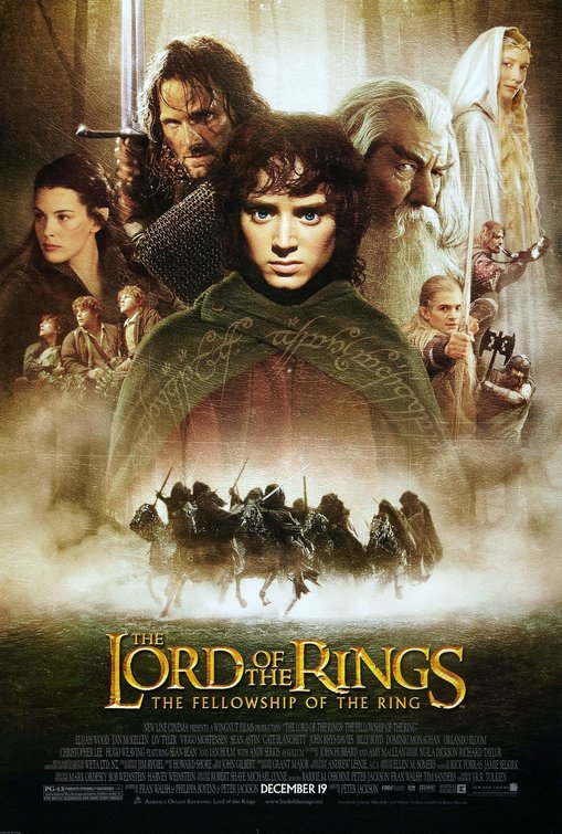
The original poster even has a green tint: [Show spoiler]
Last edited by Tech-UK; 08-15-2015 at 02:45 PM. |
![]() |
Thanks given by: | Nada (08-15-2015) |
![]() |
#14134 | |
Banned
|
![]() Quote:
|
|
![]() |
![]() |
#14135 | |
Blu-ray Baron
|
![]() Quote:
There is no question the screenshot comparisons swayed a lot of opinions initially. Yet, a number of people's opinion changed when they actually watched the disc in motion. When I first saw the shots, I was thinking "Oh my god!". Then I watched it and it was like I was watching a different disc. Even Robert Harris if I recall alluded to something similar. Now, it is true that unless someone is viewing on a properly calibrated display and is within 3 dEs of Rec 709, they are not seeing what's on the disc. If someone's display is pushing green in the greyscale, that will further skew matters so I do think that accounts for a smaller part of the problem. The reality is though, the colors are very appropriately saturated and vibrant where and when appropriate as can be seen on a properly calibrated display. Yes, there is a very subtle green or teal hue mostly notable in a few scenes, but the positives of the disc far WAY outweigh the negative of that; the EE blows away the theatrical version which looks like an upscaled DVD by comparison. And the detail and film-like look of the EE disc is stunning. The tint is so subtle that I don't even think about and as anyone knows who bothers reading my posts, I am very, very observant and picky about discs. Last edited by HeavyHitter; 08-15-2015 at 03:16 PM. |
|
![]() |
Thanks given by: | Tech-UK (08-15-2015) |
![]() |
#14136 | |
Blu-ray Ninja
|
![]() Quote:
What you say about calibration is correct, of course, at least objectively, but it's not necessarily the answer here. If someone's display is "off" it can be off in all kinds of directions, and doesn't necessarily account for The Teal, for all that it's become habitual on this site to talk about "non-calibrated displays" as if that explains the excessive use of teal (and sometimes teal/amber) in a massive number of Blu-ray transfers, and as if a teal wash is the inevitable consequence of every instance of lack of calibration; in my own observation, people often push the red on their displays more than the green, apparently because they think skin colour (Caucasian, anyway) should be rosier than most transfers usually deliver. I'm not going to quibble with some of your word choices, but I notice they're quite loaded and subjective. The green isn't "very subtle", and it's not only in "a few" scenes at all, as just two examples; but it's not my intention to nitpick. Yes, the EE transfer is streets ahead of the non-extended Blu-rays in clarity and detail, but that was one of Jackson and Lesnie's stated intentions in their remastering efforts, and it's not in fact relevant to the issue of concerns abour the the colour grading. People talking about watching the transfer in motion is the same-but-opposite of people looking at static comparisons: screenshots may heighten the differences, but with the transfer in motion the eye loses reference, looks at relative colour differences rather than objective ones (like an a cappella choir slowly, collectively bending the pitch of a performance piece) and quickly loses its memory of any overall slant in the colour values -- the same way people living near construction sites stop hearing (or think they do) the jackhammers and cement mixers. But that doesn't mean the sound isn't there. (Apologies to Bishop Berkeley.) To bring it back full circle: if you don't notice the colour slant (or, as Frogmort pointed out, the loss of the sunlight), then fair enough, and half your luck! Doesn't mean the problems aren't actually there, though, nor that people who are bothered by them are simply misled, by screenshots or whatever else. |
|
![]() |
Thanks given by: | Biggiesized (09-10-2015), Falaskan (08-15-2015) |
![]() |
#14138 | |
Blu-ray Baron
|
![]() Quote:
And by the way, your words are just as subjective as we are both basing opinions which is the case for 99% of the posts on the forum. It's discussion. Get over it. But I never stated everything about this issue I say is 100% fact, but I have strong opinions here. However, I think the whole screencap situation is very obvious to a lot of people in the problems it creates where it becomes almost a witch hunt of sorts on certain titles (Goodfellas remastered another case in point where it became as ridiculous or even more so than this title) where things become completely blown out of proportion. I am not saying there is no value in screencaps as there is - but they do not, nor ever will tell the full story as the eyes see the image differently in motion - and you are undermining the importance of calibration still. I'll state again: it is IMPOSSIBLE to see accurately what's on a disc UNLESS your display have been properly/professionally calibrated to Rec 709 (this also means a high quality meter that is up to par). If you display is not, you cannot - will not - see exactly what's on the disc. And this is fact by the way, not opinion. It's math basically. Just curious - has your display been properly calibrated? A lot of non-calibrated displays push green in the greyscale; it has nothing to do with user preferences or saturation levels. A display must be calibrated to 6500K greyscale in order to see white as neutral as possible. Given there is a bit of very slight green push on the disc and a display that is not at 6500K greyscale can/will accentuate this significantly if green is above 100. Proper calibration greatly diminishes the tint issue on this disc. I've had people watch this disc on my display and they thought it looked gorgeous. |
|
![]() |
![]() |
#14139 | |
Blu-ray Ninja
Oct 2008
|
![]() Quote:
|
|
![]() |
Thanks given by: | HeavyHitter (08-15-2015), ilovenola2 (08-15-2015) |
![]() |
#14140 | |
Banned
|
![]() Quote:
|
|
![]() |
|
|
![]() |
![]() |
|
|